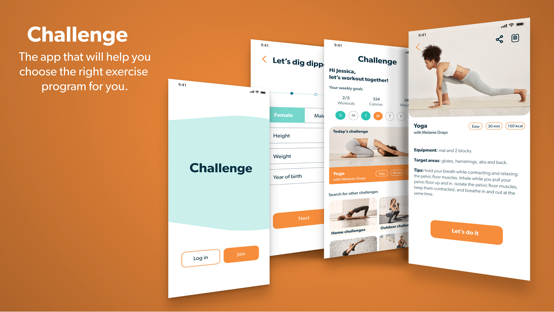
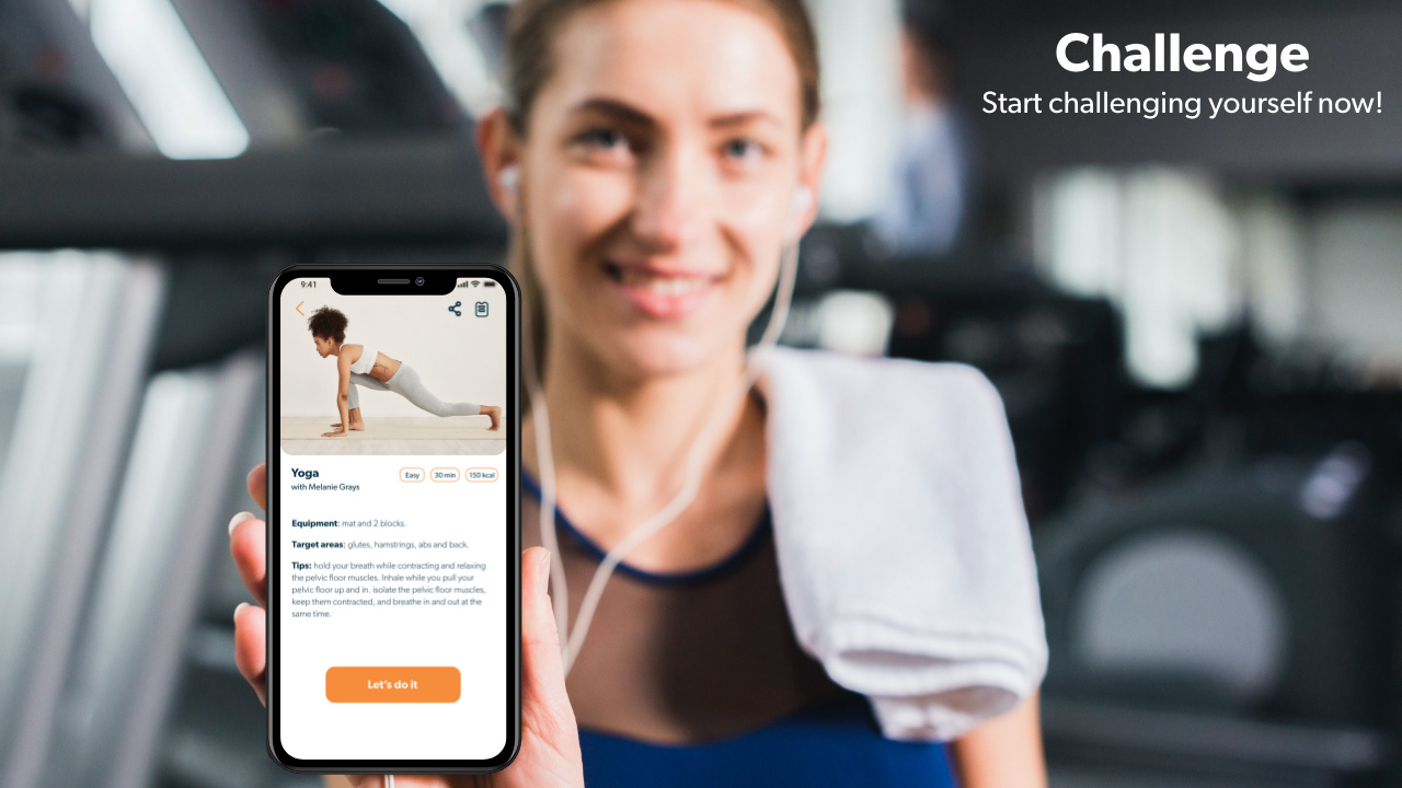
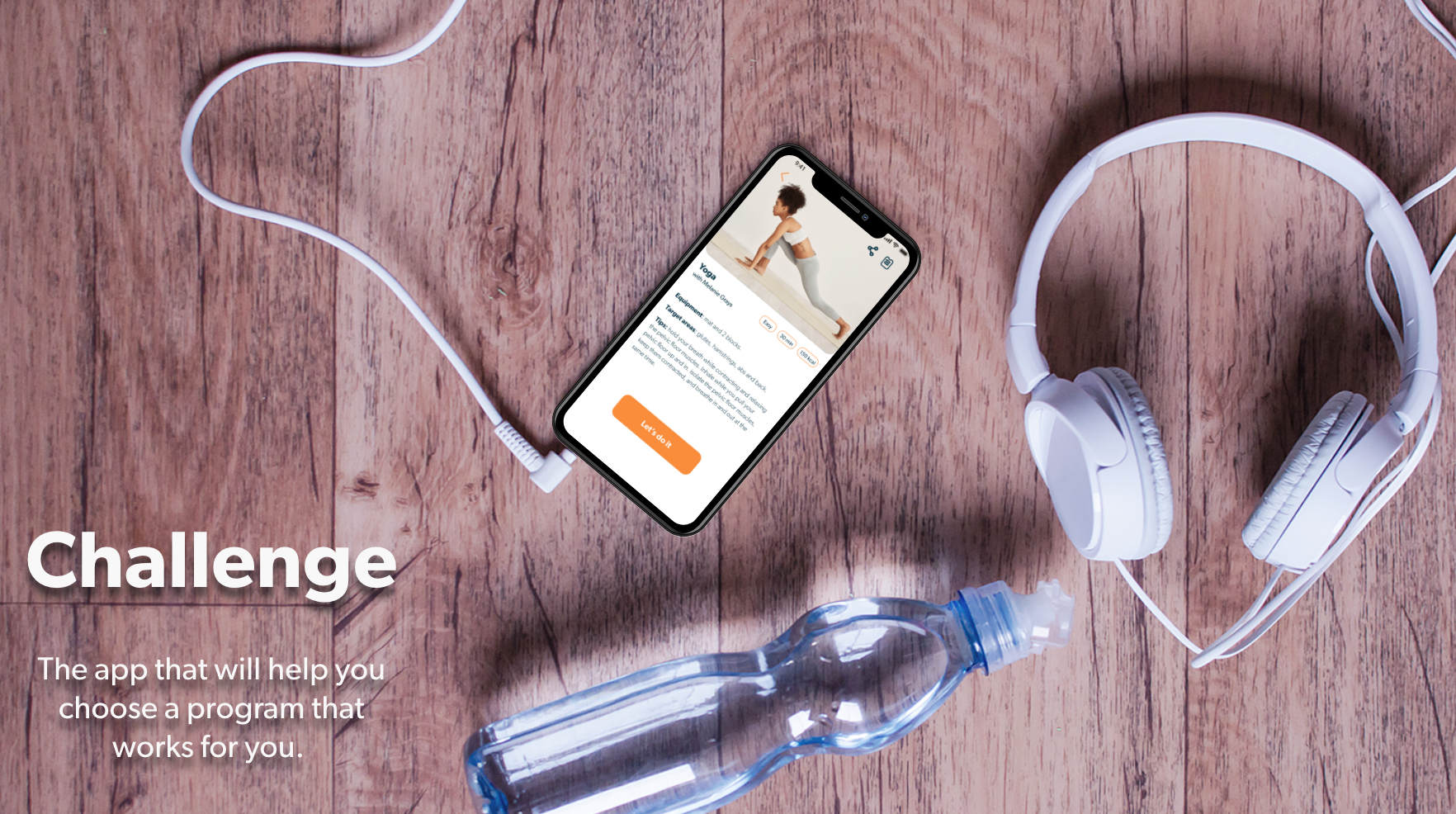
Problem
It is difficult for someone busy to take their time and decide what kind of exercise routine they should follow. To succeed, it has to fit with their level, schedule, and interests. I wanted to solve this issue with the responsive app Challenge because I personally struggle with finding the resources and motivation to work out.
Approach
I applied mobile-first design approach and I was responsible for both UX and UI. Some of the steps that I did to get to the final outcome were:
- User research and defining the user persona, user journey and workflows
- Creating the visual design, defining the experience's typography, color, interactions, animation, and branding
- Designing for mobile, tablet, and web breakpoint
Tools used
Keynote
Pen and paper
Adobe XD
Timeline
1 months
Click the play button to see the final outcome
Warm up
User Persona
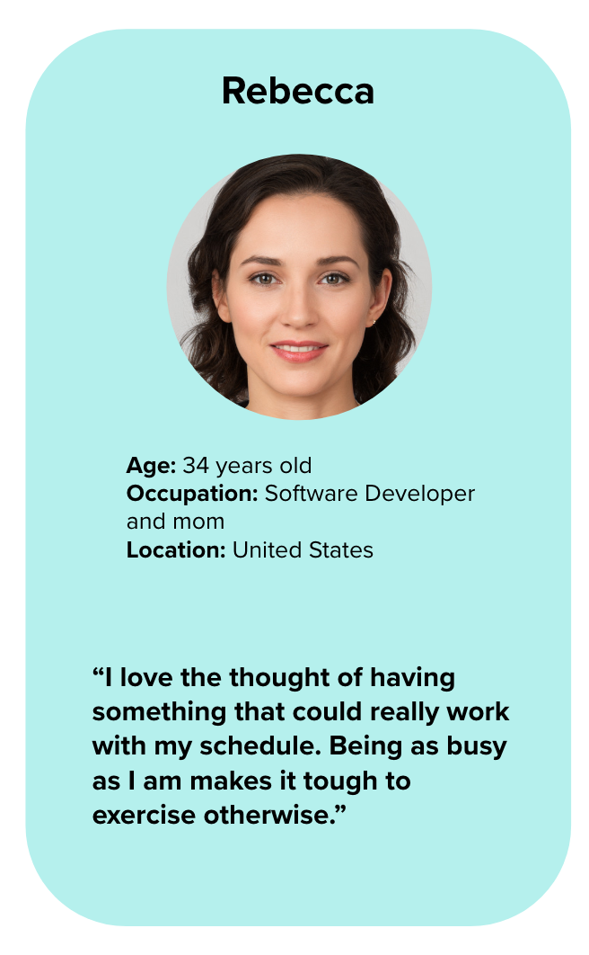
Goals
- Rebecca wants to lose weight and get in shape, as her sedentary job doesn’t allow a lot of time for exercising.
- To help with this goal, Rebecca wants to find a tool that will help her fit exercise routines into her busy schedule.
- As a beginner to working out, Rebecca also wants something that will help her learn how to properly exercise.
- Rebecca wants to be able to find exercises that match her goals of losing weight and getting in shape.
- She wants the tool to keep her motivated as well, as her schedule can often be distracting
Environment
Physical: Rebecca lives in an apartment with her boyfriend and 3-year old daughter.
Social: She has several friends from her software development job, and one of them recommended this tool as something she should check out to help her reach her goals.
Technological: Rebecca is very tech savvy, as she works on computers every day.
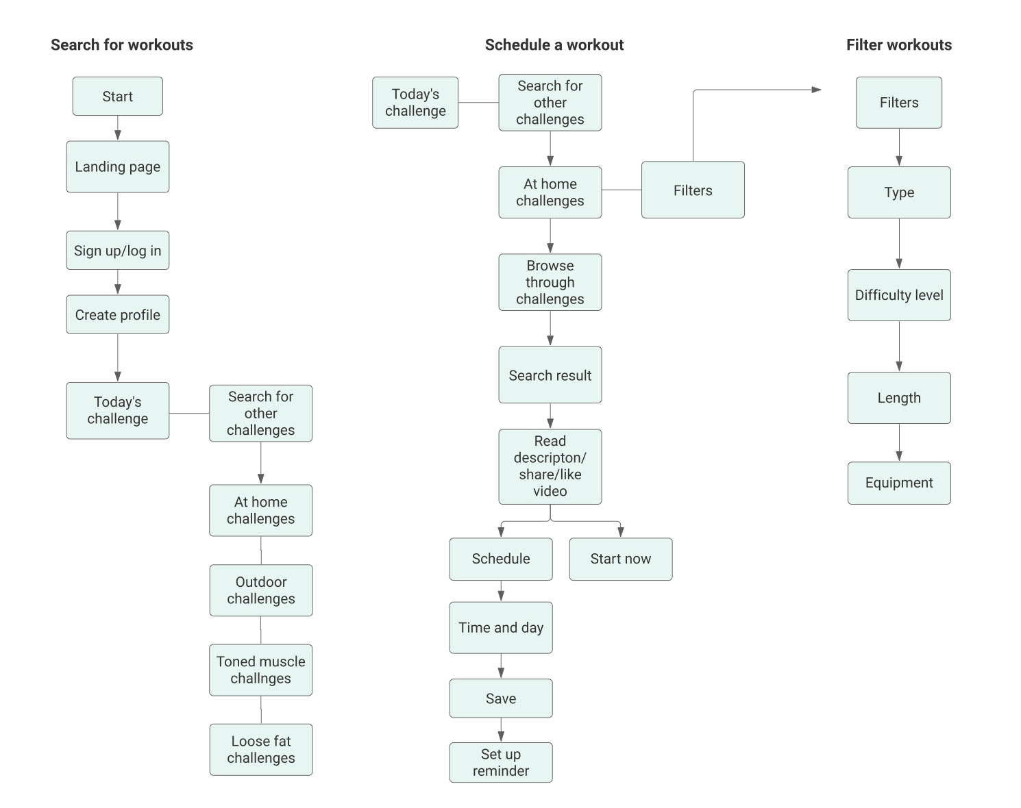
User Flows
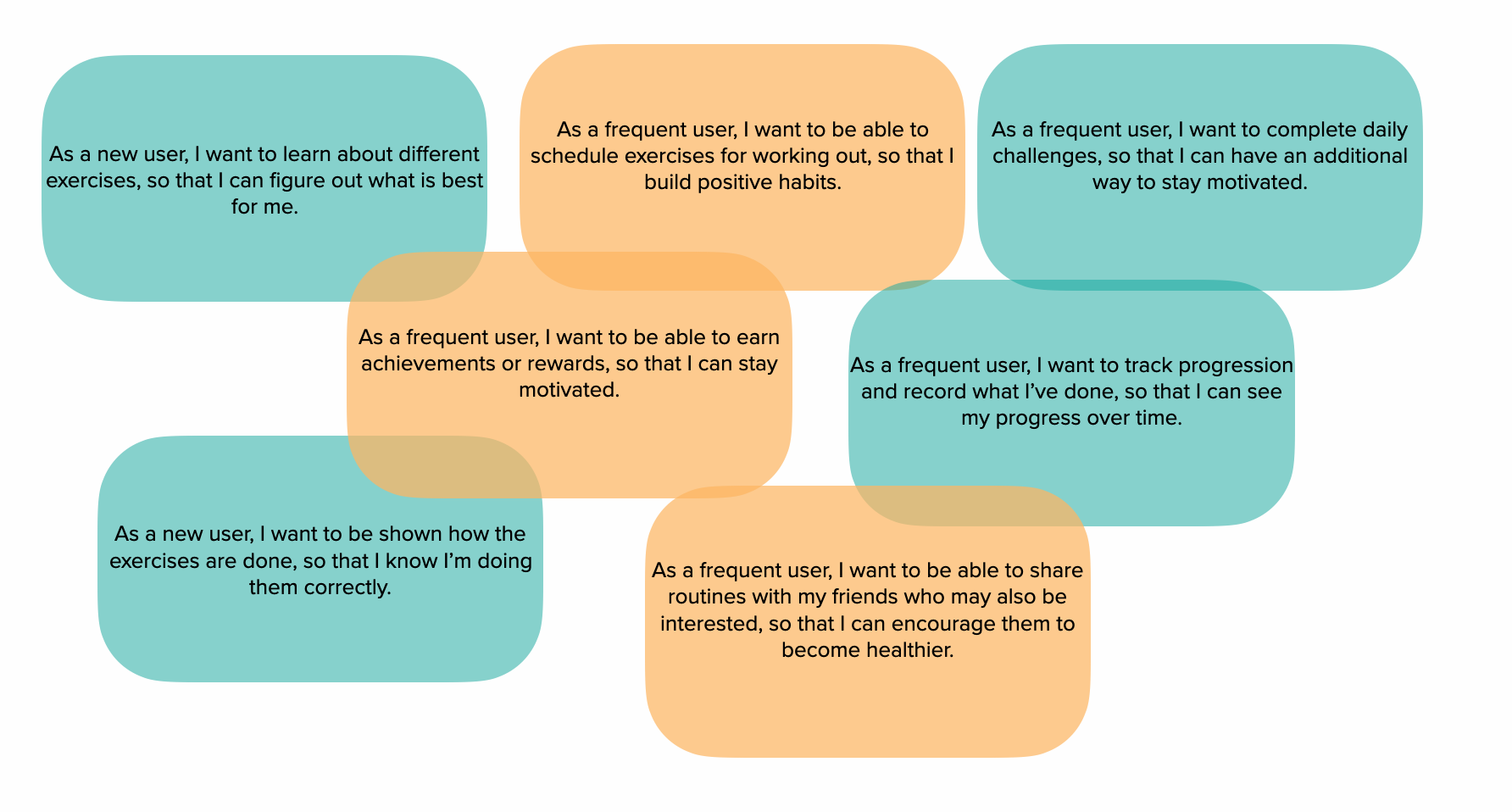
User Stories
Action
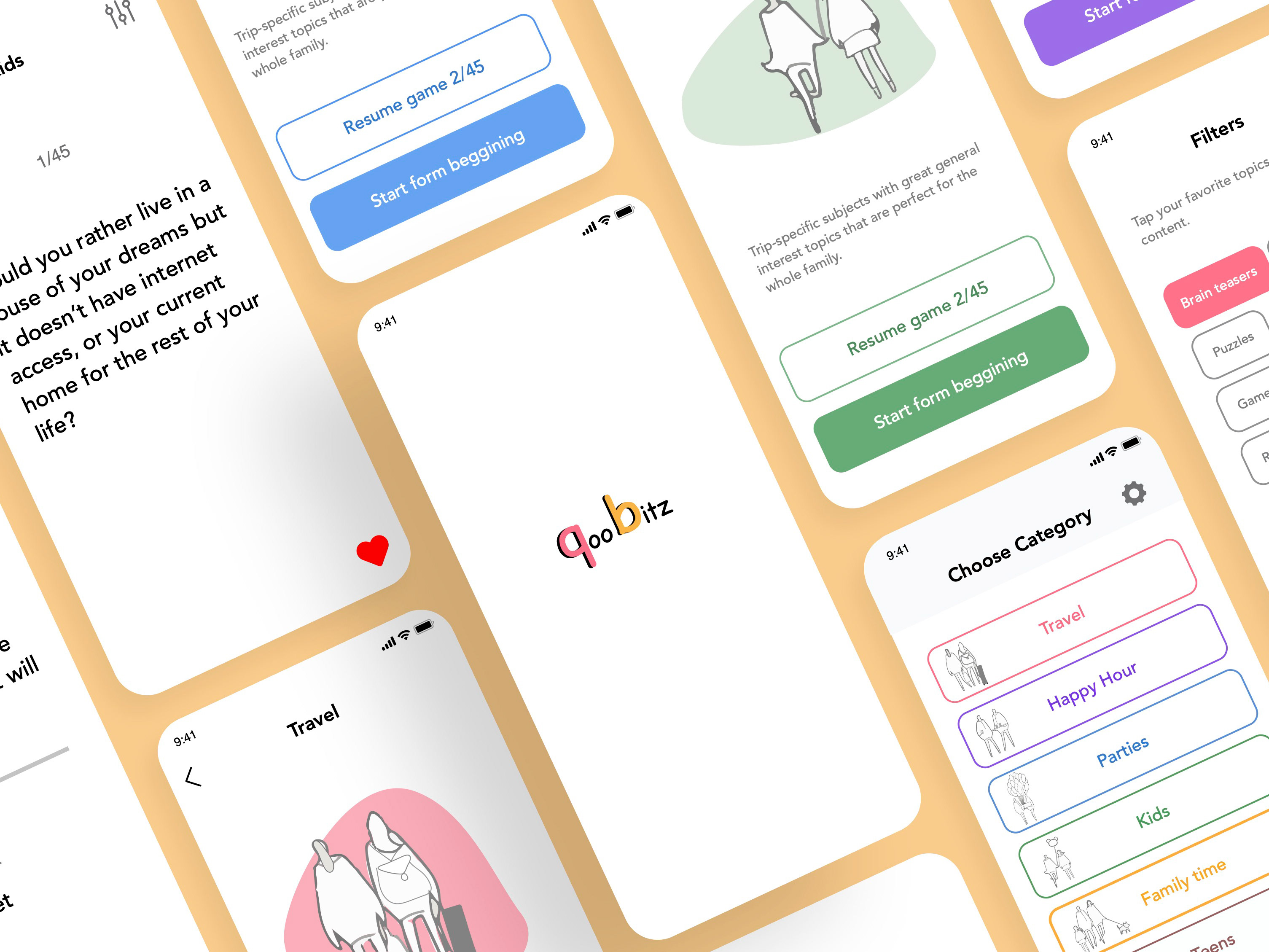
Wireframes
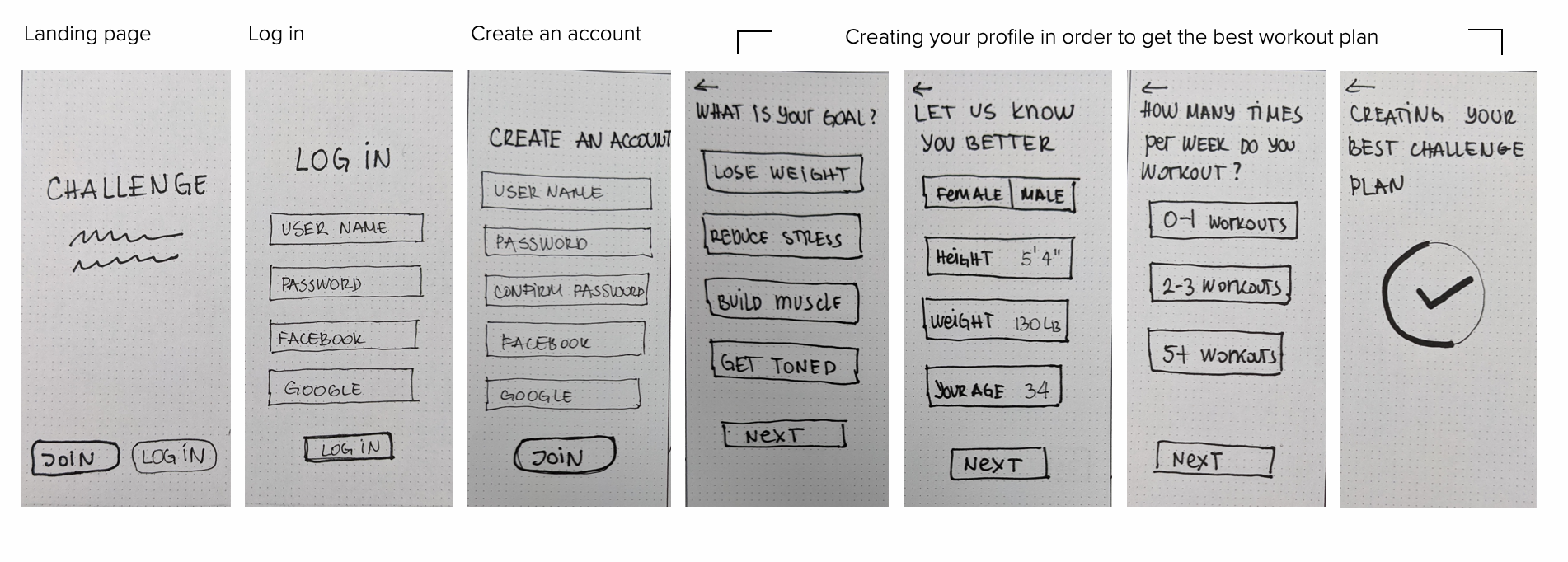
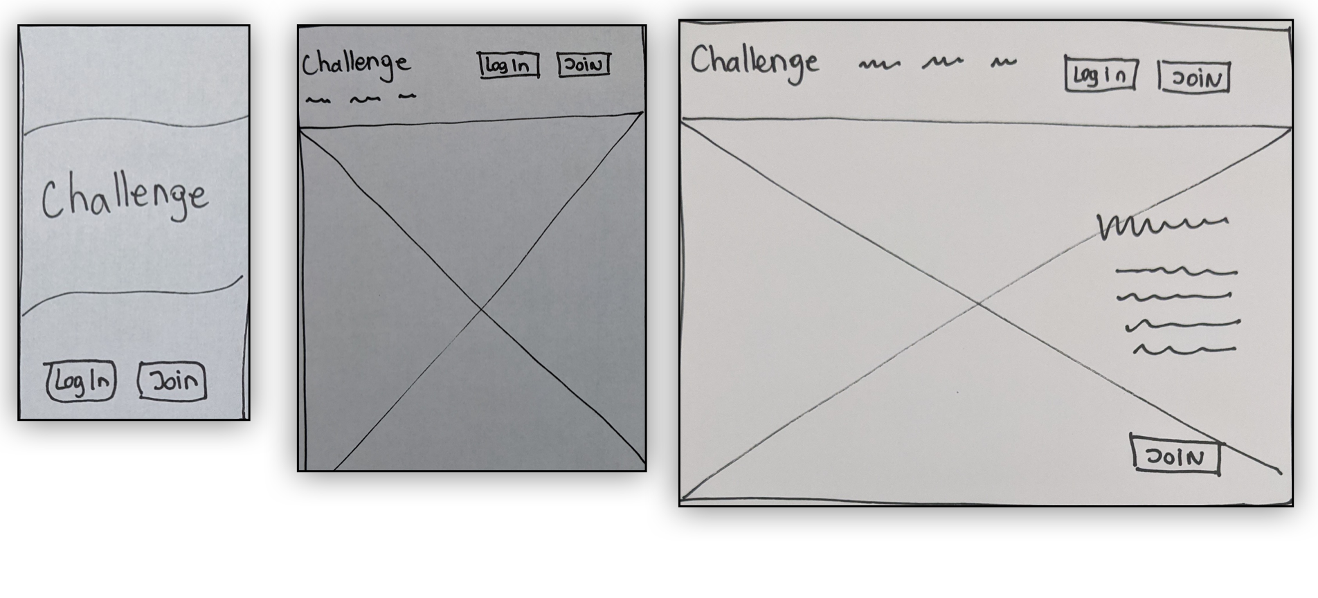
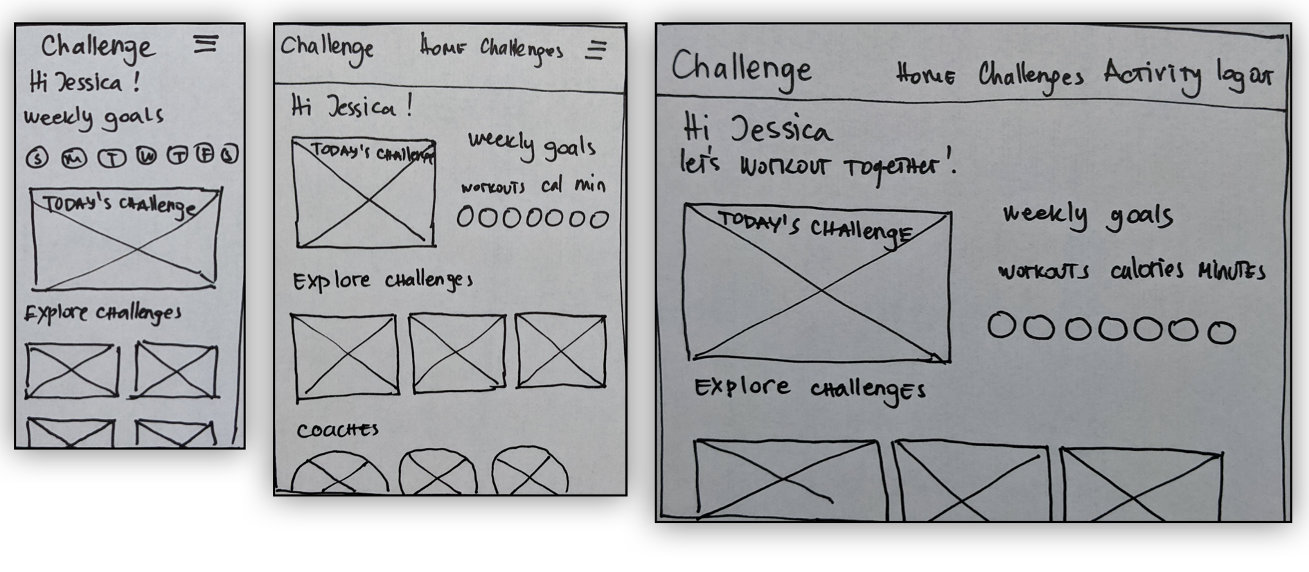
I started sketching low-fidelity wireframes to reflect the steps in the user flow. After the initial sketches, I designed mid-fidelity wireframes adding in more screens.
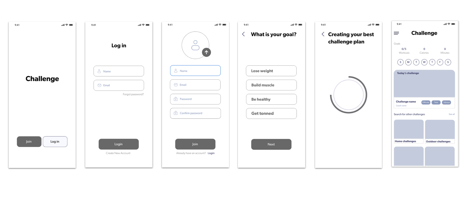
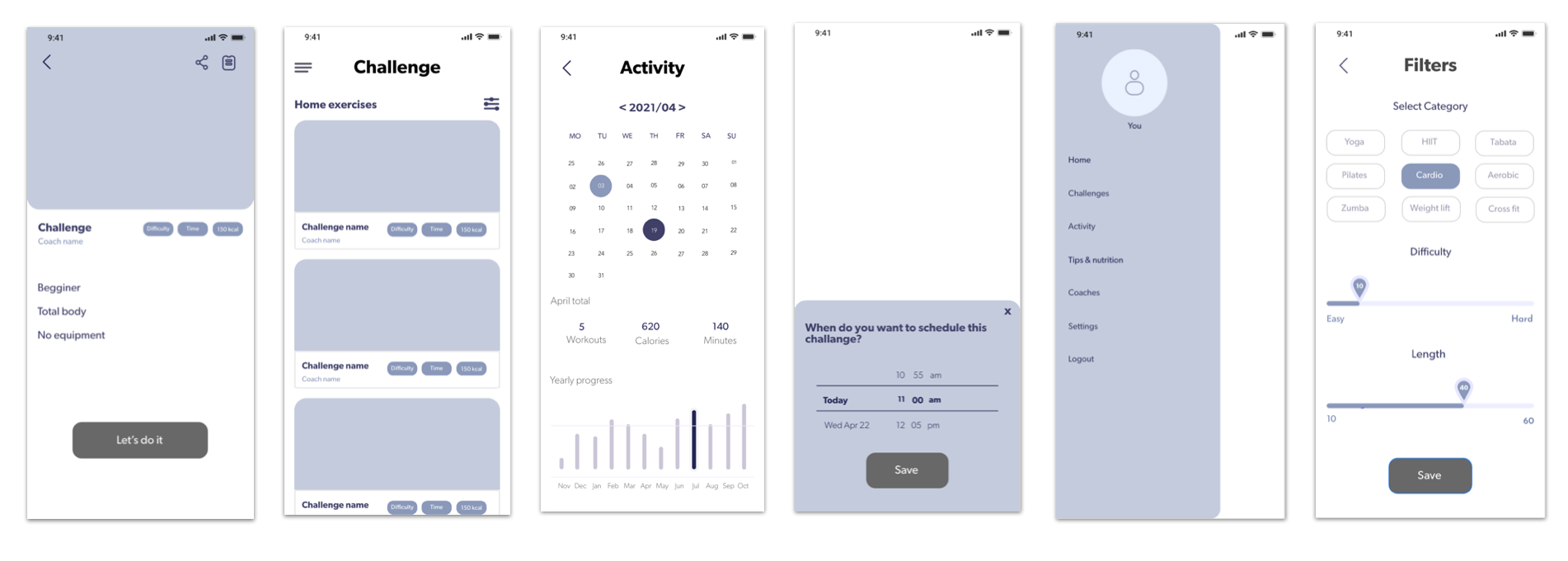
Low fidelity wireframes
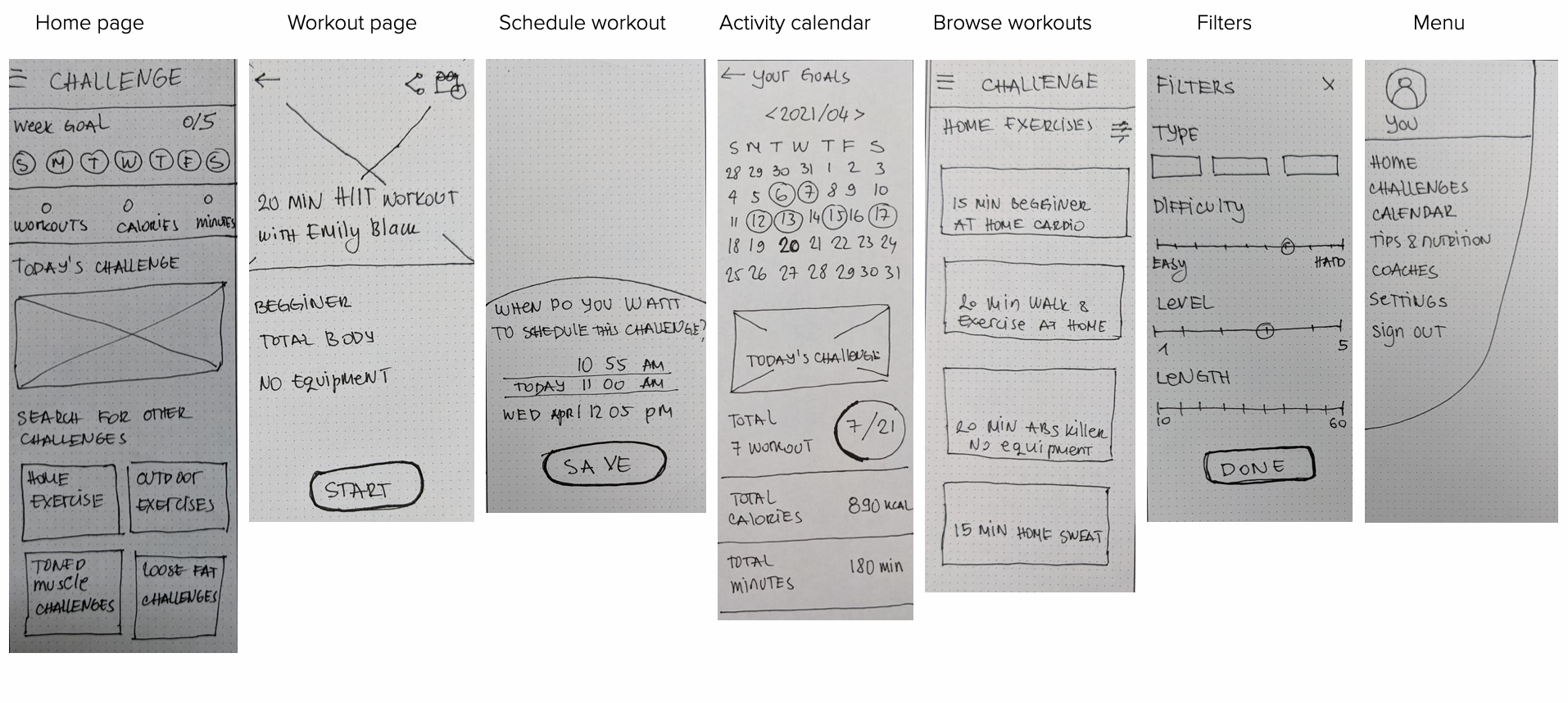
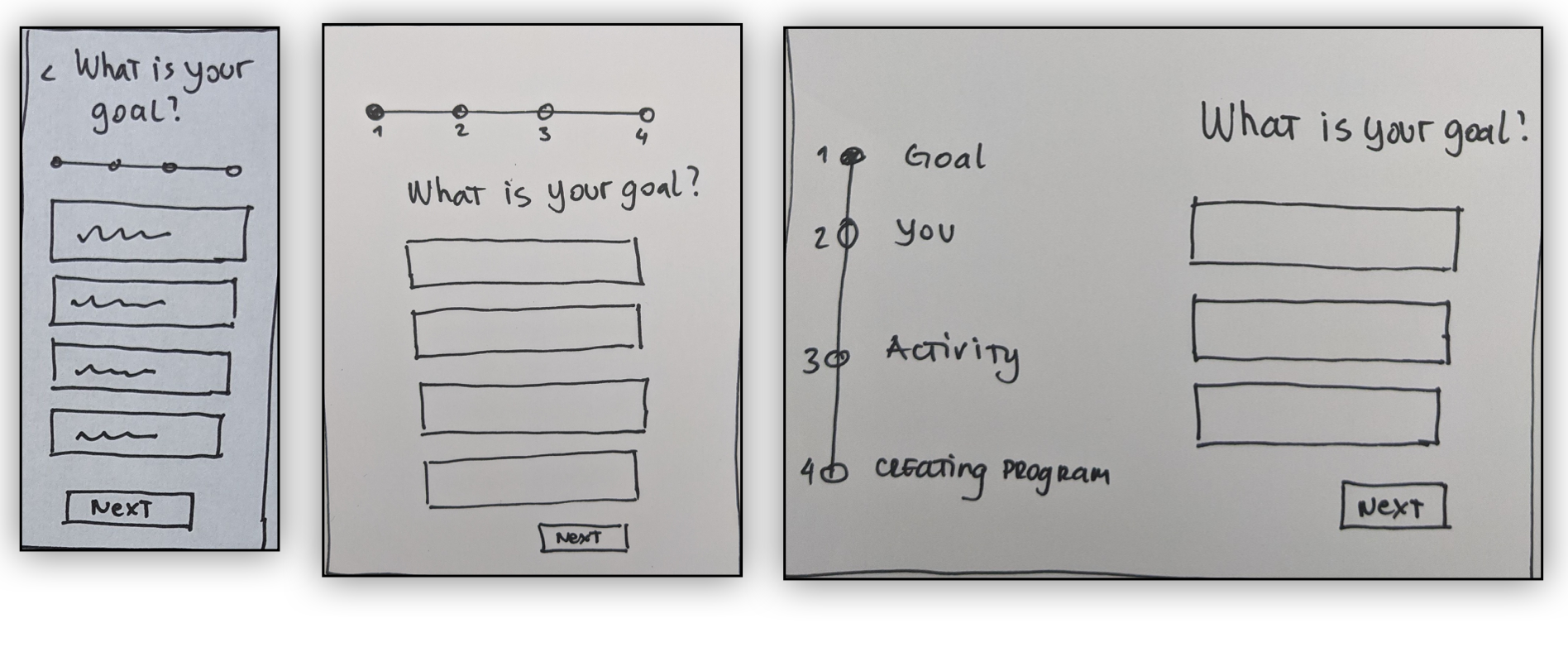
Mid- fidelity wireframes
Mood board
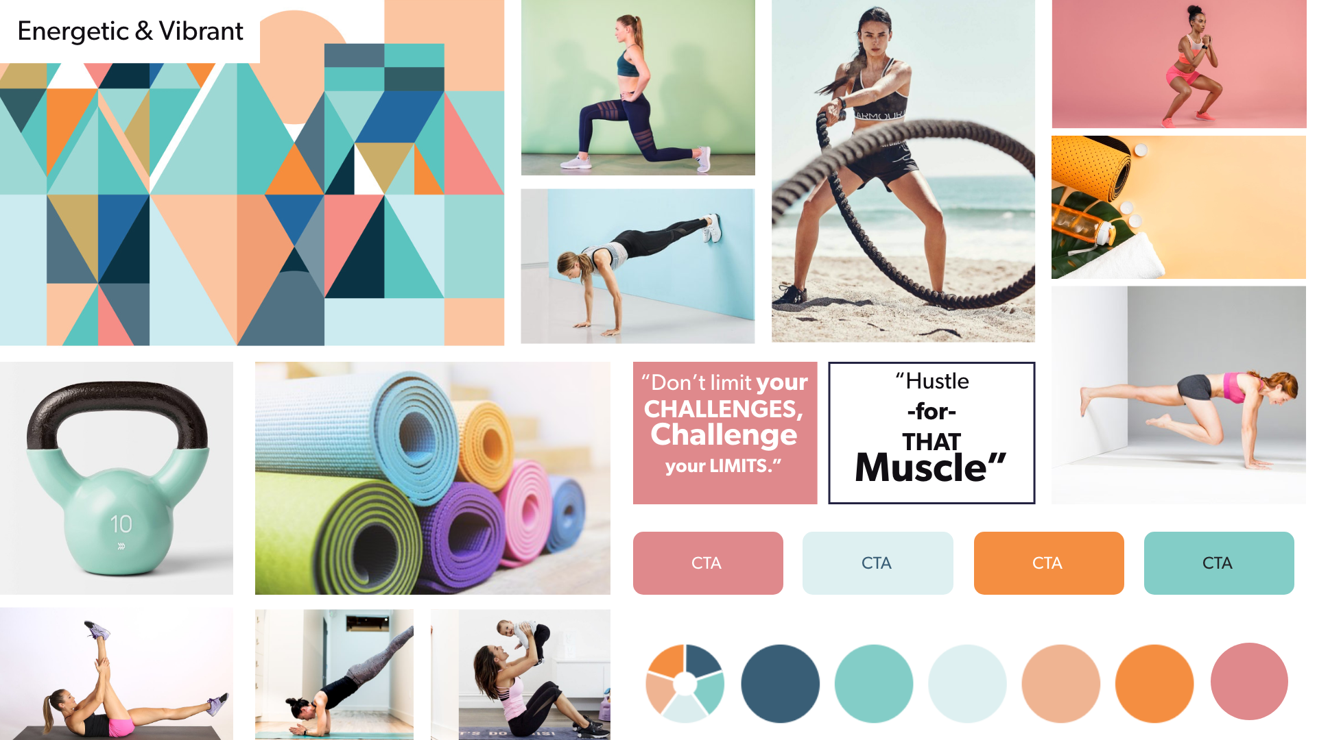
I created a mood board to help determine the direction of style for the app. The board is with energetic and vibrant color palette that evokes energy, strength, and balance and is complemented by brighter photos. These design treatments reflect the goal of encouraging and welcoming those who are just new or returning to fitness and a healthy lifestyle.
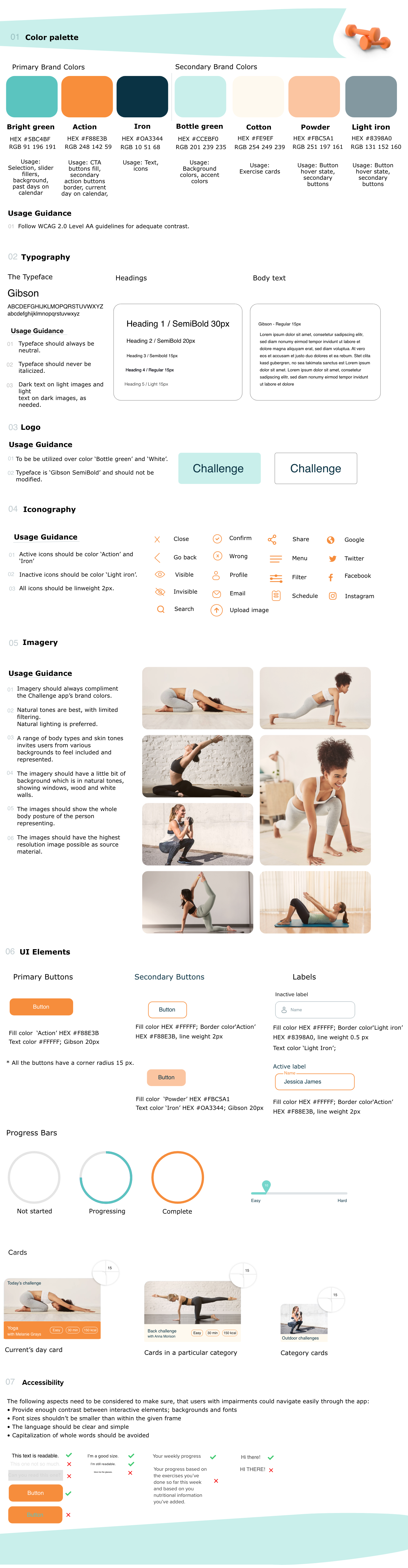
Style Guide
Designing for different breakpoints
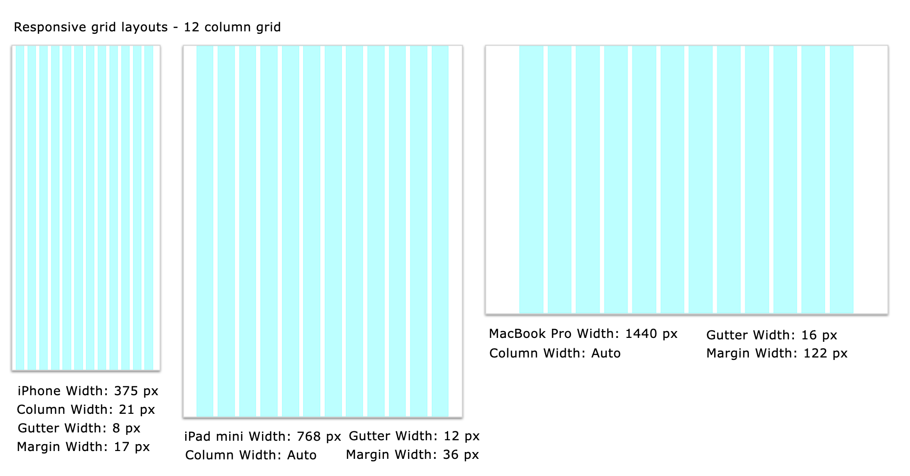
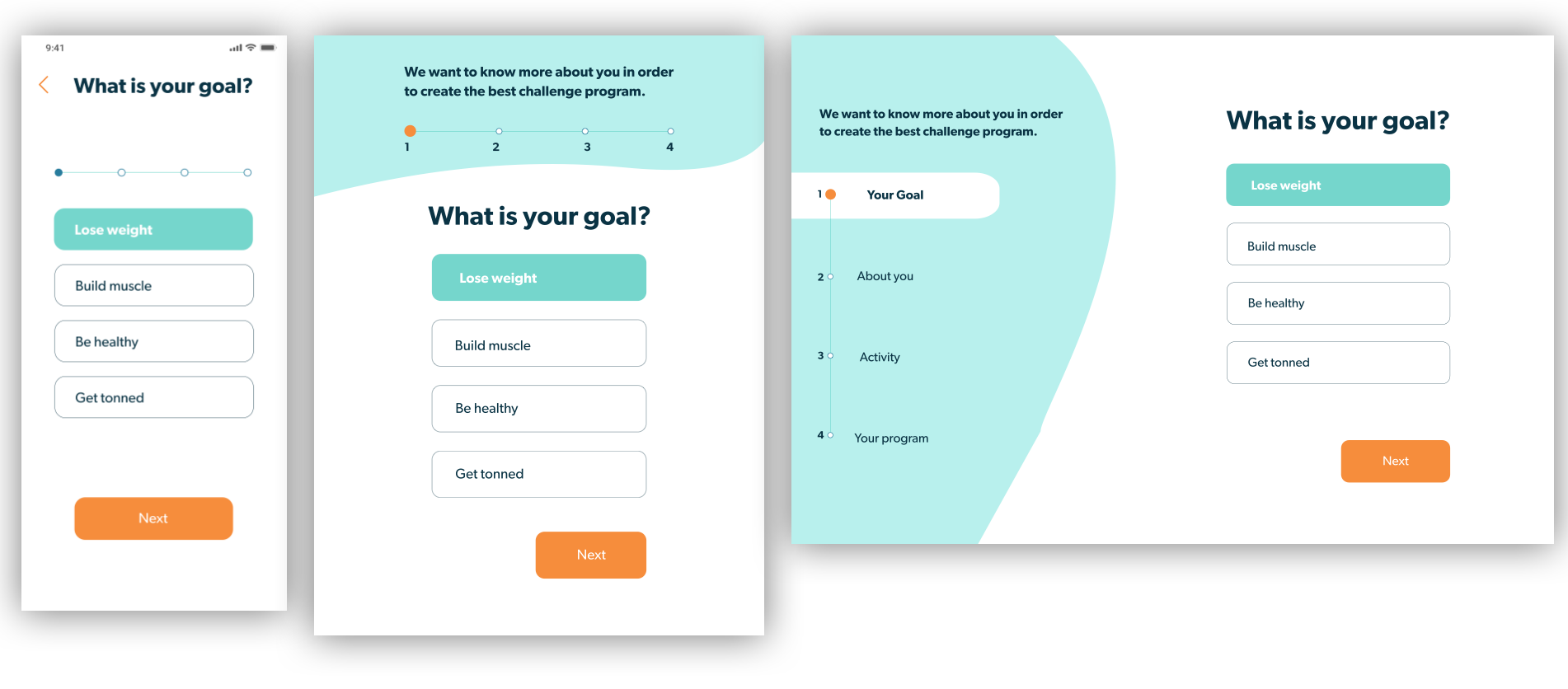
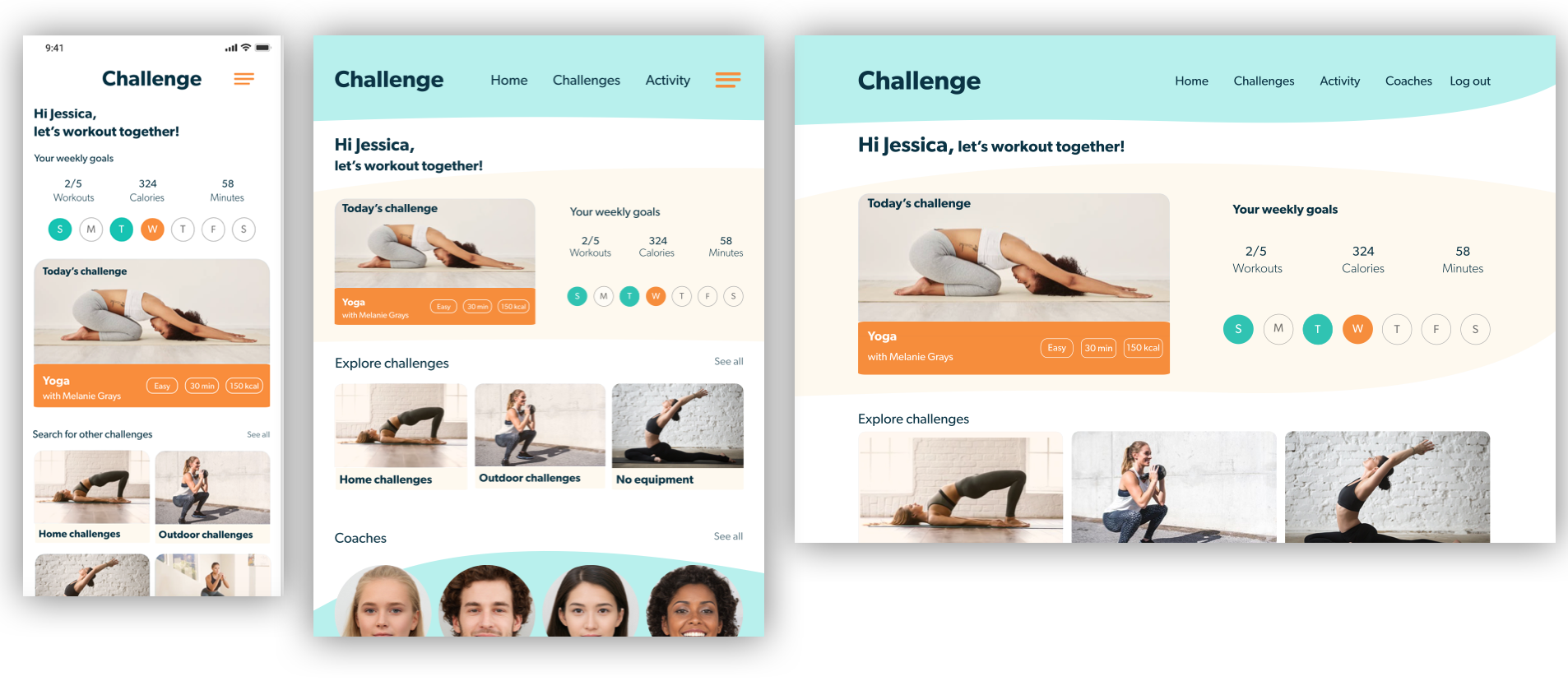
To begin making my designs responsive, I developed mockups from the low-fidelity wireframes for mobile, tablet, and desktop. With the mobile-first approach, I reworked the design for the larger breakpoints after finalizing the high-fidelity wireframes for mobile. For all breakpoints, it was important to simplify both the content on the page with minimal information as well as the flow from page to page in order to complete a task.
Cool down
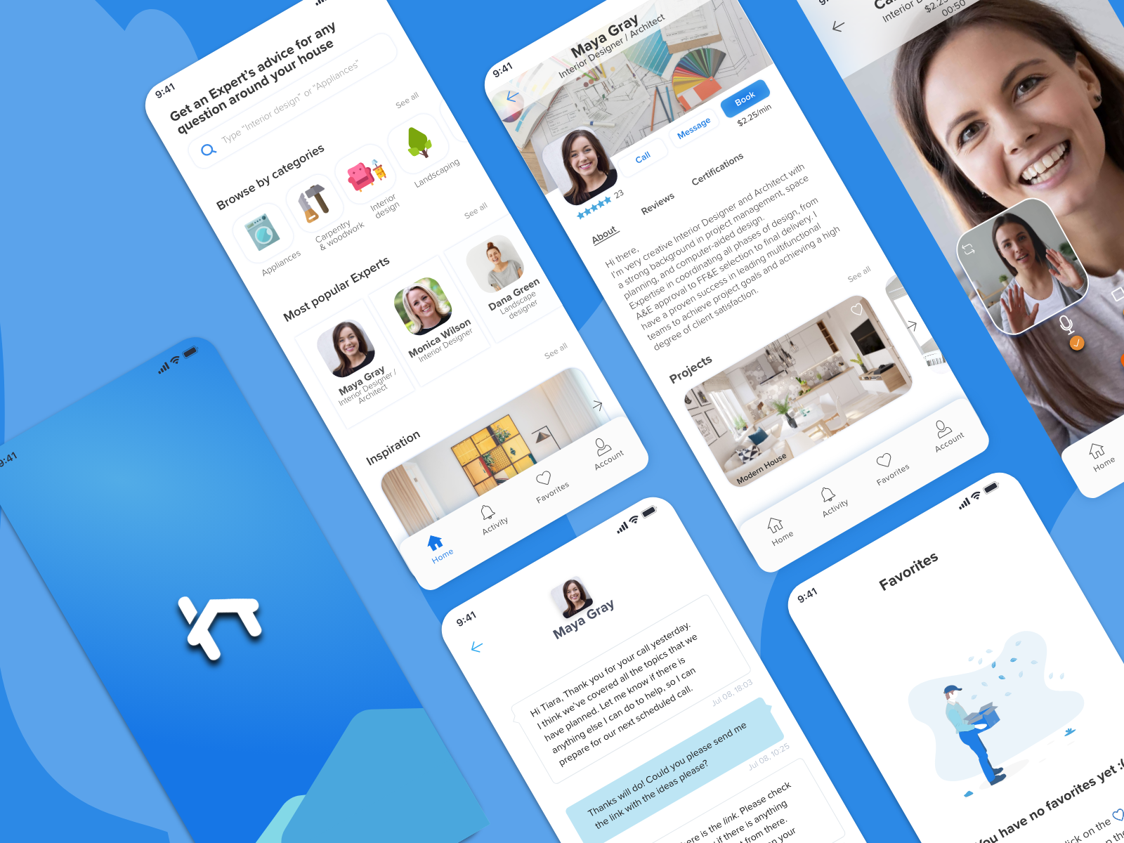
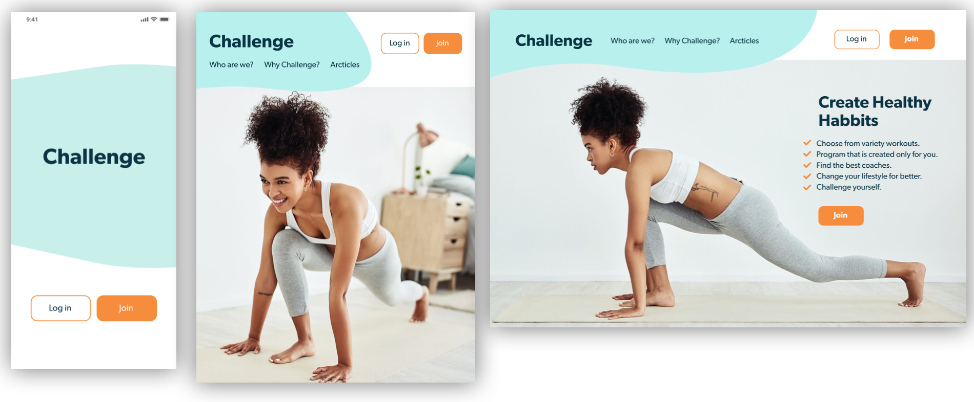
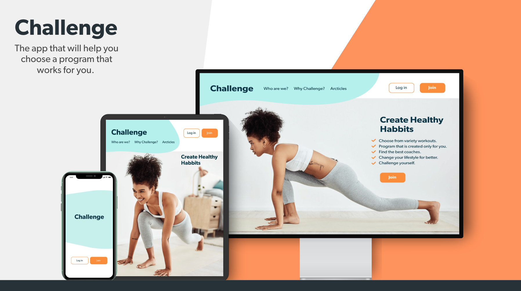
Final mockups
Takeaways
This project gave me the opportunity to learn more about UI, what goes into good design, and how to make a product look sleek, modern, and enticing. I had to take into consideration the needs of the users on different devices, since they won't use the app for the same reasons on the different devices.
I also learned that UI is very fun, creative and challenging!
Being a UI designer is more than just pushing around pixels on the screen. It’s about embracing the design process. It’s about trying something, testing it and iterating until you’ve found the best possible solution to the problem. Like anything worth doing, this can sometimes be tough and a bit frustrating, but that’s how we learn.
Thank you!