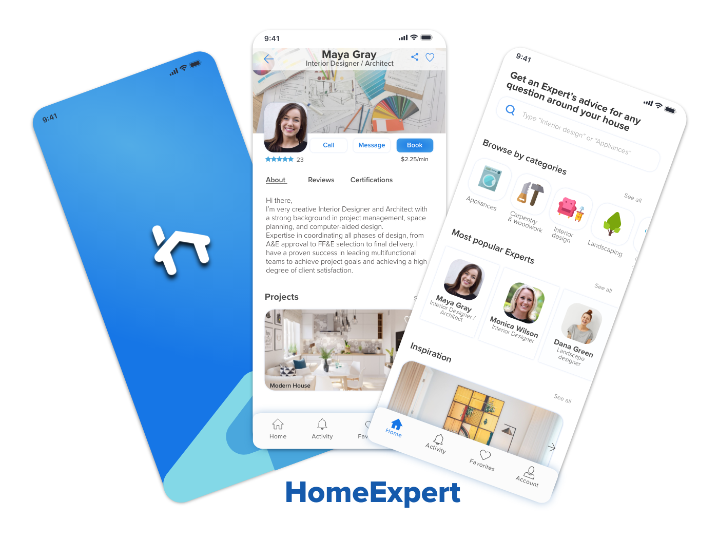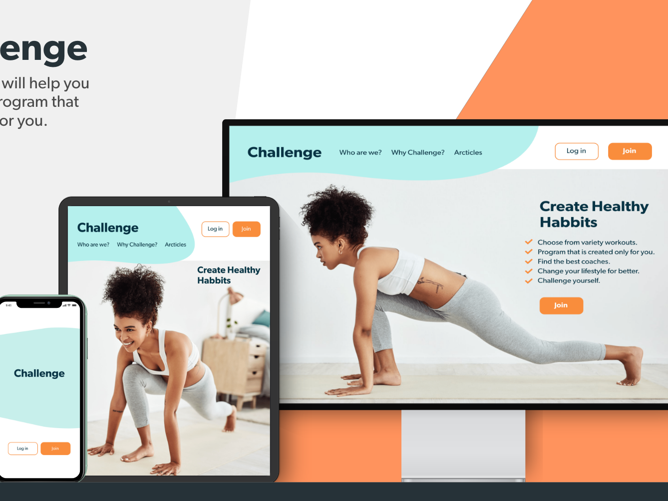

Design Problem
Our users need a reliable and efficient way to instantly connect with trustworthy experts in household-related fields when they encounter challenges at home. They seek quick, accurate answers to their specific questions, ensuring their issues are resolved promptly and effectively.
Potential solution
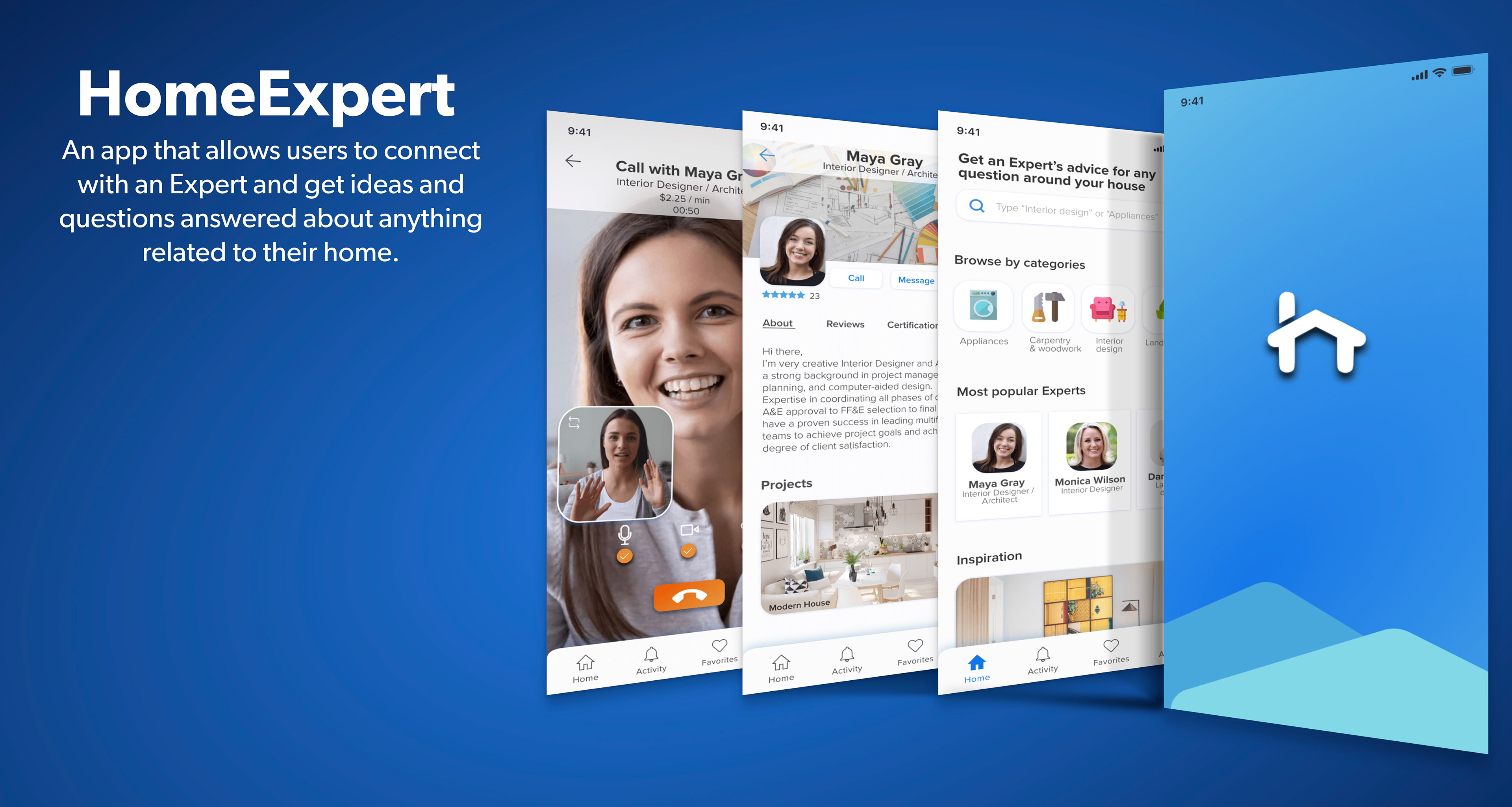
The goal of this app is to give people simple, intuitive way to connect with an expert within seconds so they can feel more informed and they can try to fix their issues right away by themselves. They can browse through different categories of experts and find the right one who is professional in the related field.
My Contribution
Understanding the Problem
Competitor Analysis
User Research
Personas
Information Architecture
Wireframes
Prototyping
User Testing
Visual Design
Click the play button to see the final outcome
Understand
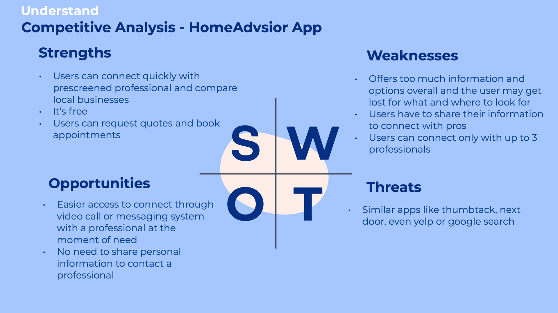
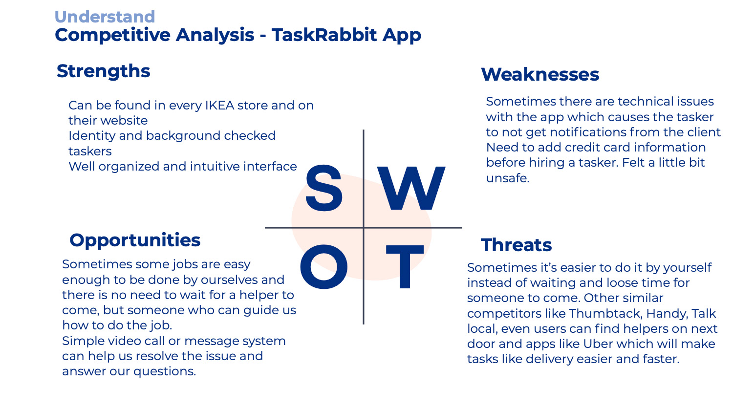
Competitive analysis
I took time to research and see which are the strong competitors on the market that have similar capabilities. The most popular and similar applications that I found were HomeAdvisor and TaskRabbit.
Here is a sample of my SWOT analysis
Observe
User interviews
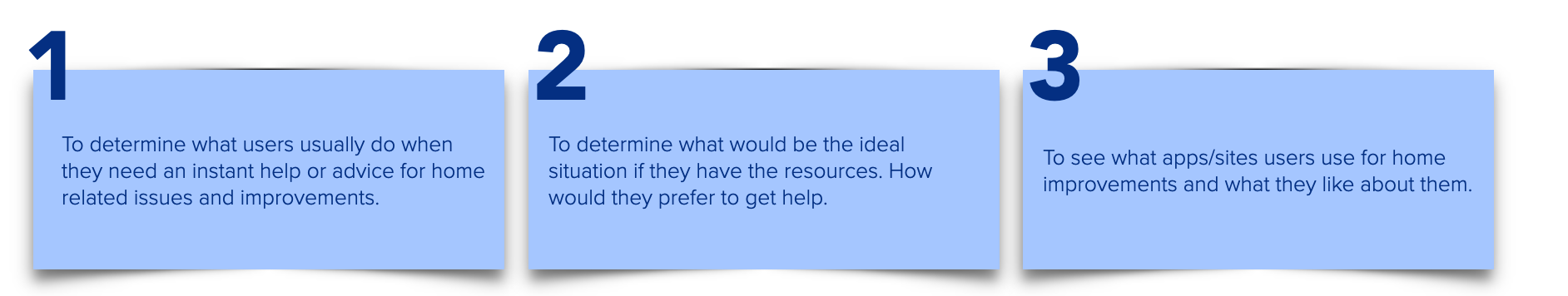
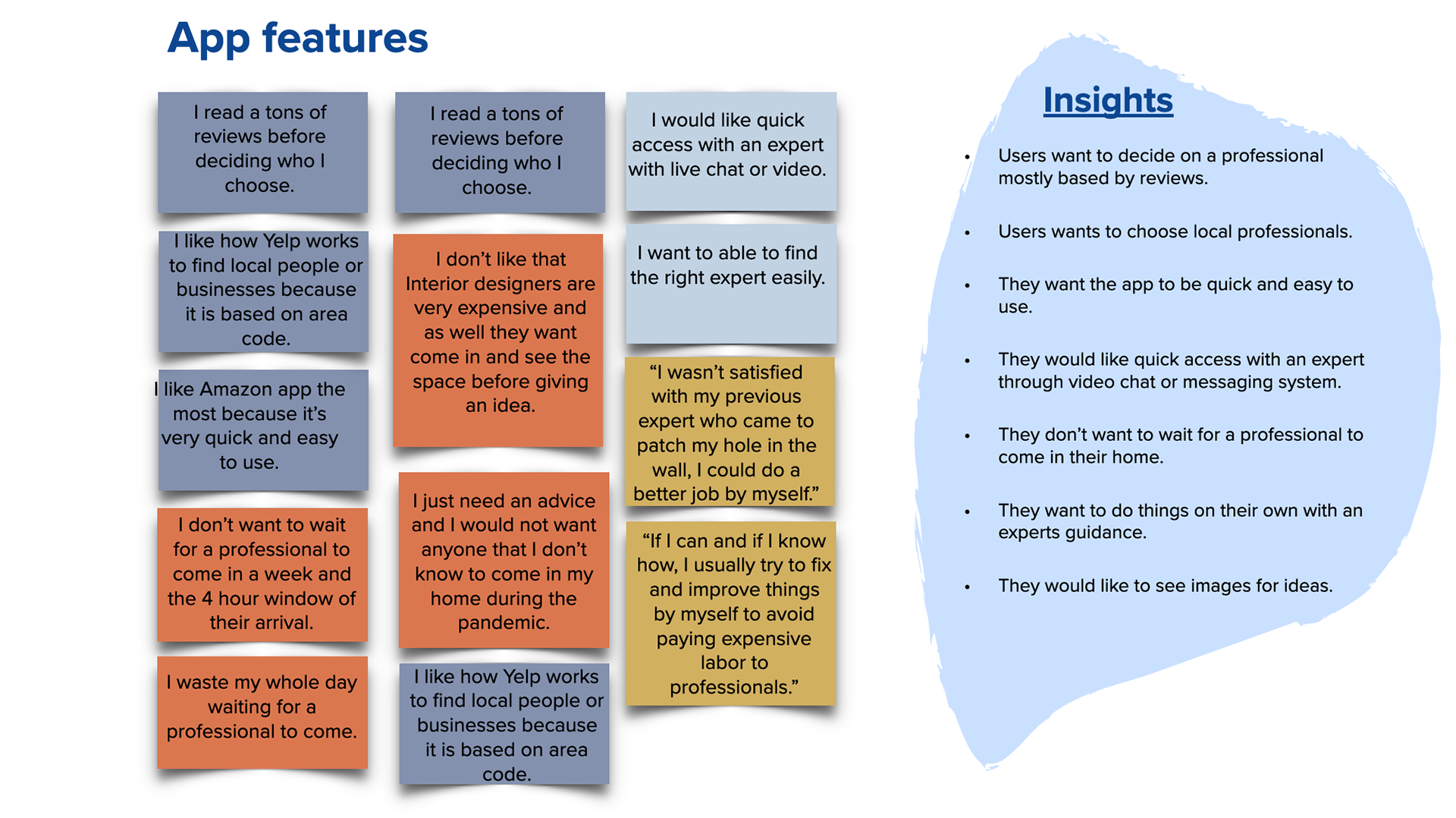
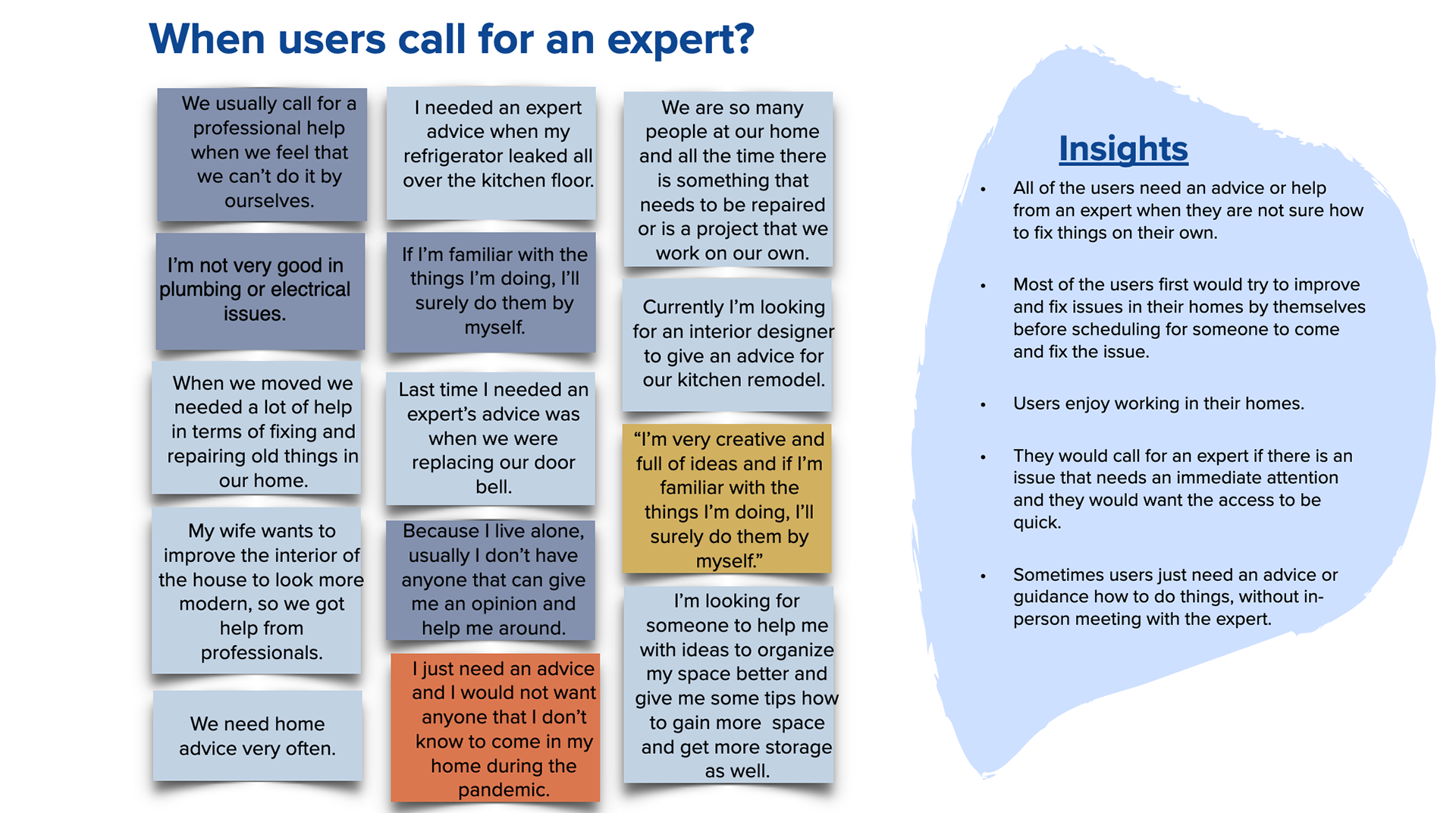
One of the most important parts at the beginning of the design process was to learn more about the users, their needs, frustrations and see their ideas about a possible solution. Therefore, I elaborated a script with questions and recruited participants to get their thoughts, actions and struggles they had when looking for an expert as well as any ideas on the design of the app. At the end, I compiled the findings into an affinity map (available below) which helped me analyze the data and define the problem.
Here are my research goals
Observe
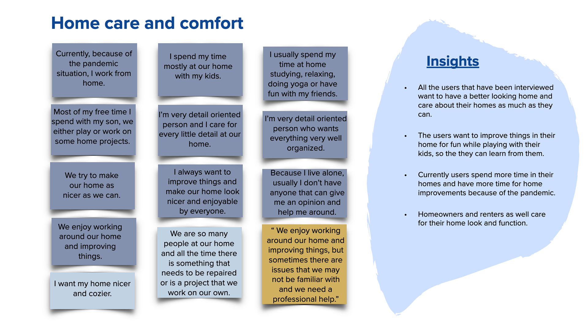
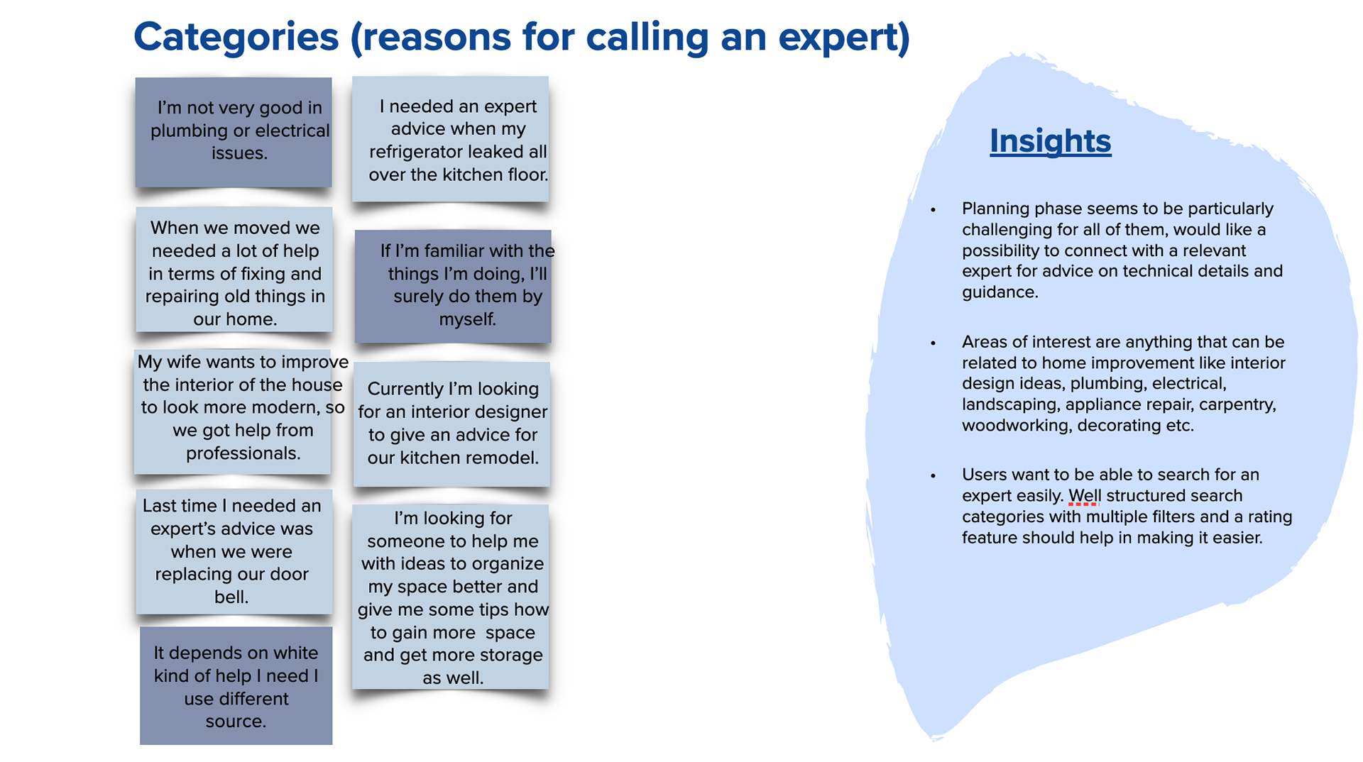
Participants & key insights from user interviews
All of my interviewees enjoy improving and fixing things on their own.
I realized that there will always be a need for an expert's advice related to home improvements. There are variety of issues or questions that can arise related to our homes and we can't be the expert in every field.
The first thing that users want to do is to try to fix their home issues by themself, then hire a professional.
Some of them are frustrated to wait for an expert and wait for days, even weeks for the scheduled appointment.
And some don't want in-person visits because of the Covid -19 pandemic.
And most of them would pay for an on-call or video chat with an Expert if it's quick, affordable, and easy to use.
Observe
Affinity map
I created an affinity map and sorted the data into clusters based on themes I identified.
Point of view
User personas
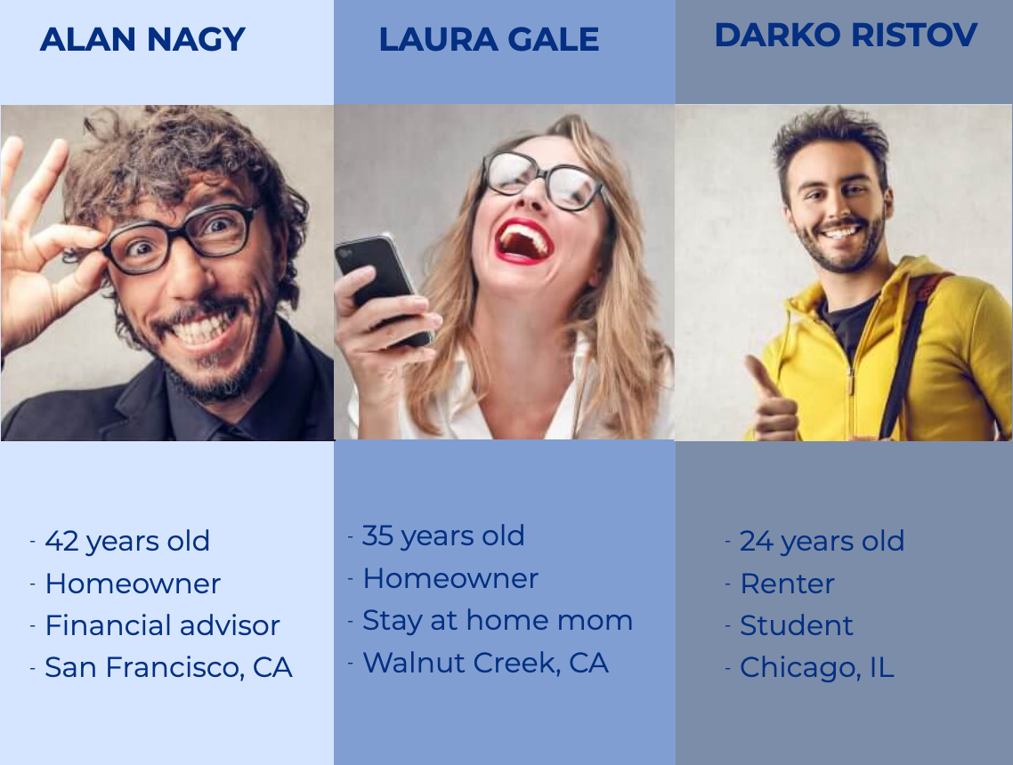
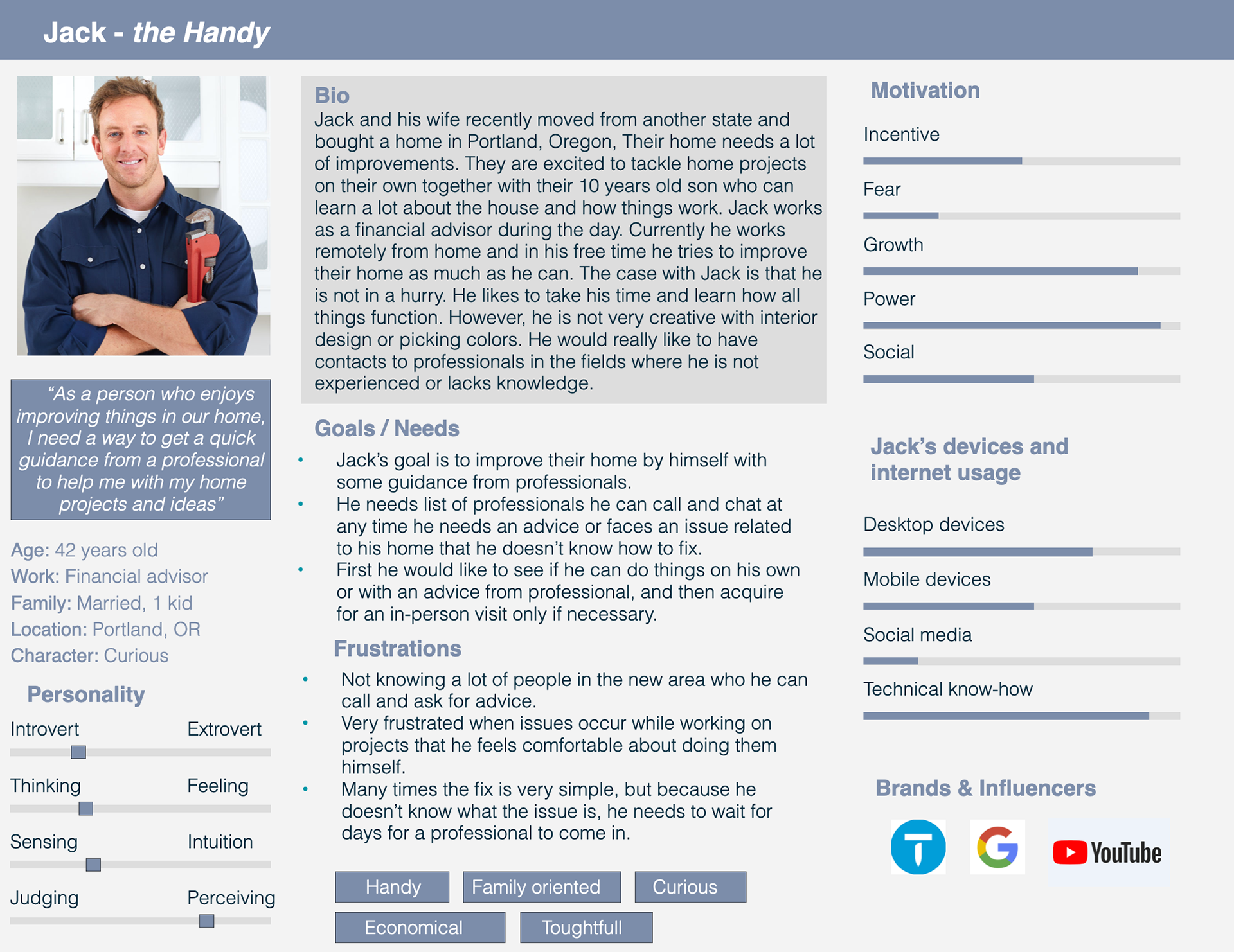
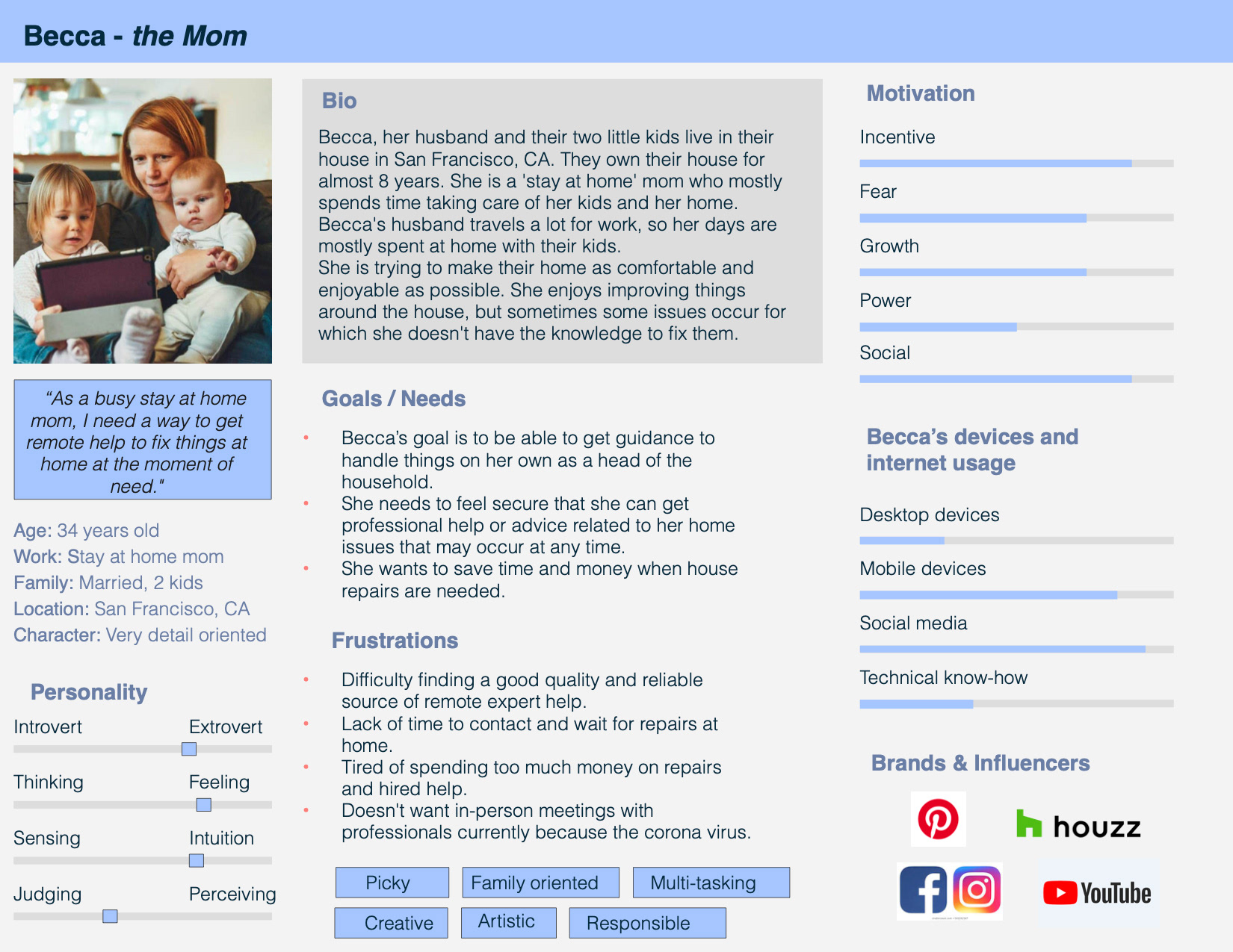
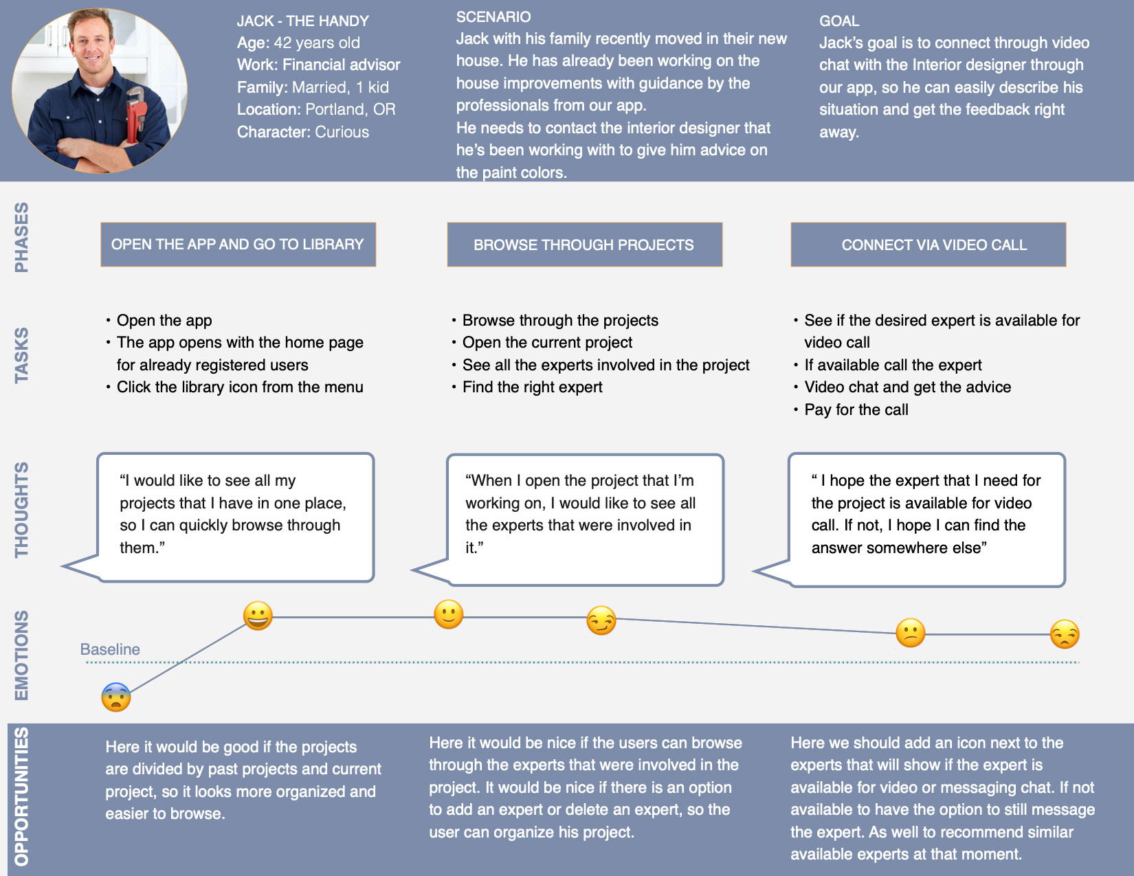
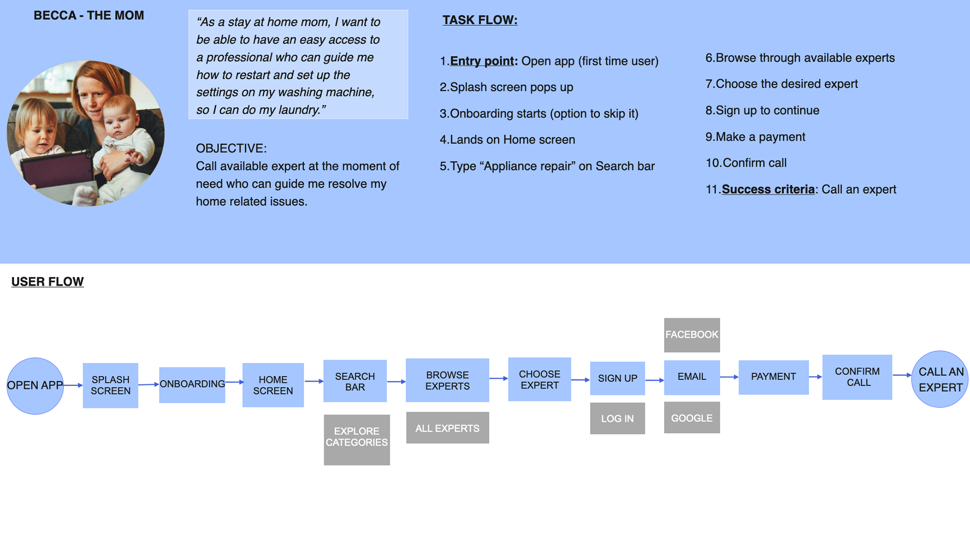
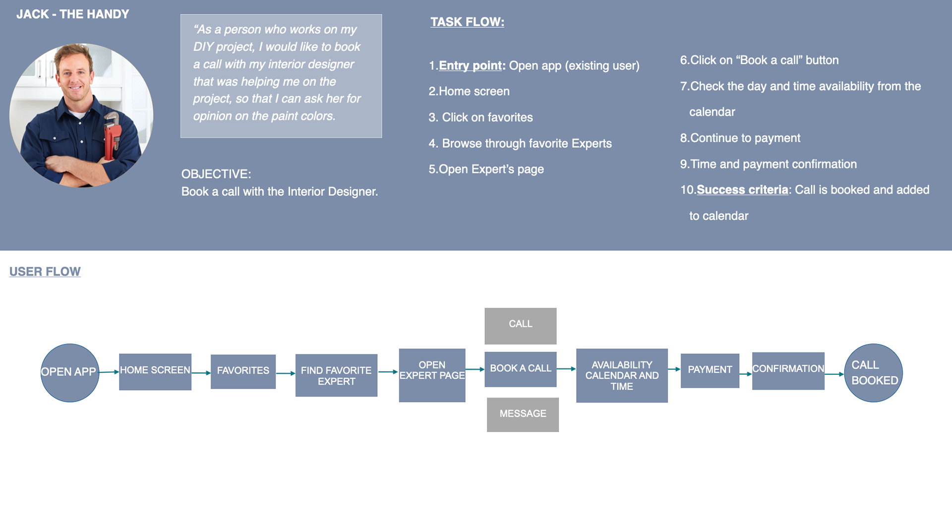
Once I identified the problem and gathered all the information from my user interviews, I created two personas. One of them is Becca, the busy stay at home mom who needs help to fix small home issues at the moment of need. The other is Jack, the handy guy who enjoys fixing things on his own.
Creating user personas allowed me to focus on user motivations, behaviors, and challenges.
Point of view
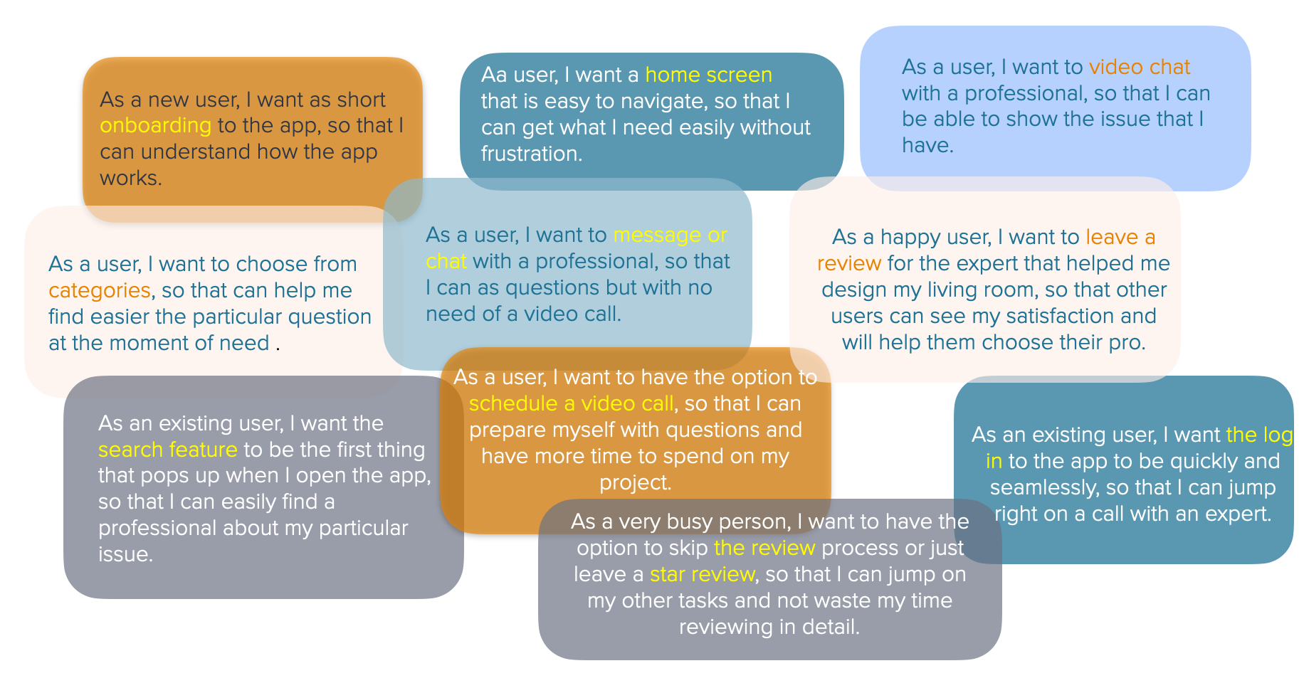
User Stories
Point of view
Journey maps
By creating the journey maps I understood the users better, their specific needs, motivations, and frustrations. Secondly, scenarios and goals allowed me to dive deeper into specific challenges the user may face and their emotions at each step of their journey.
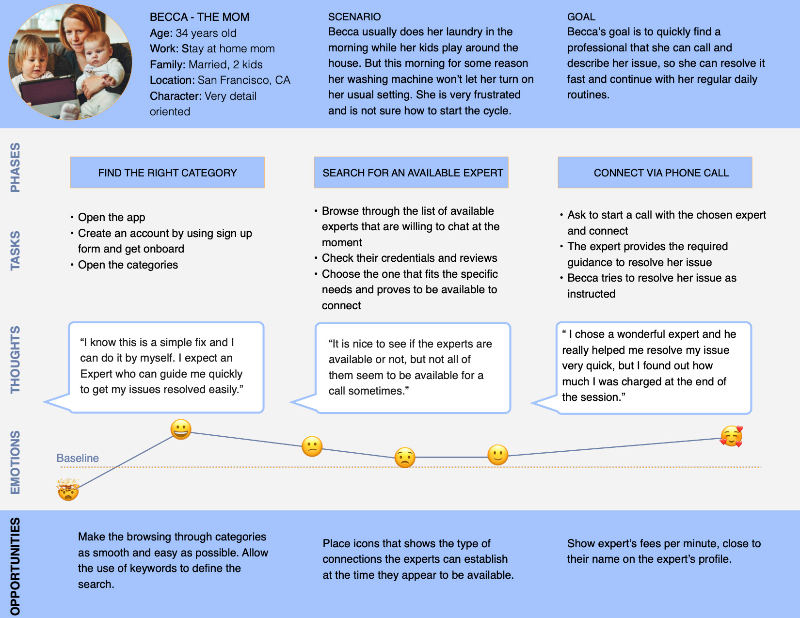
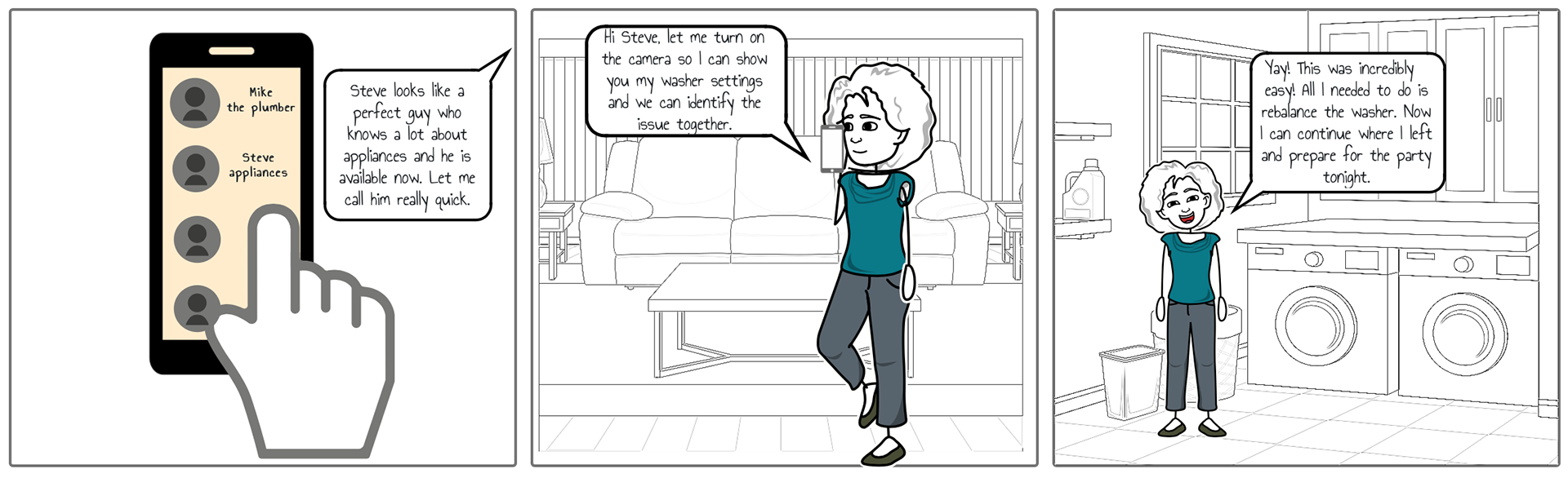
Example Scenario
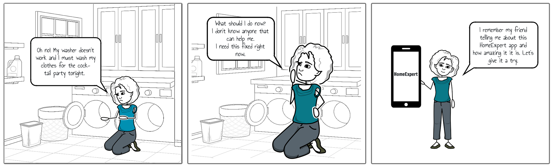
It's Friday afternoon and Becca has a cocktail party planned for the night. She wants to quickly wash her clothes for the party, but she realizes that something is off with the washer settings, she can't turn it on. She decides to try the HomeExpert app to see if she can find someone to help. She finds the appliance Expert, who is available to chat with her right away. She shows him the issue through a video call and they both fix the washer settings while on the phone. Becca is so happy that she can continue with the preparation for the party.
Point of view
User tasks & user flows
Ideate
Card sorting
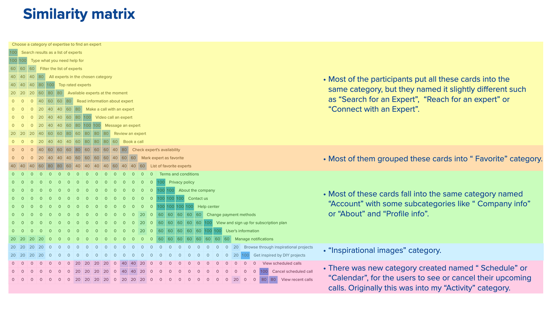
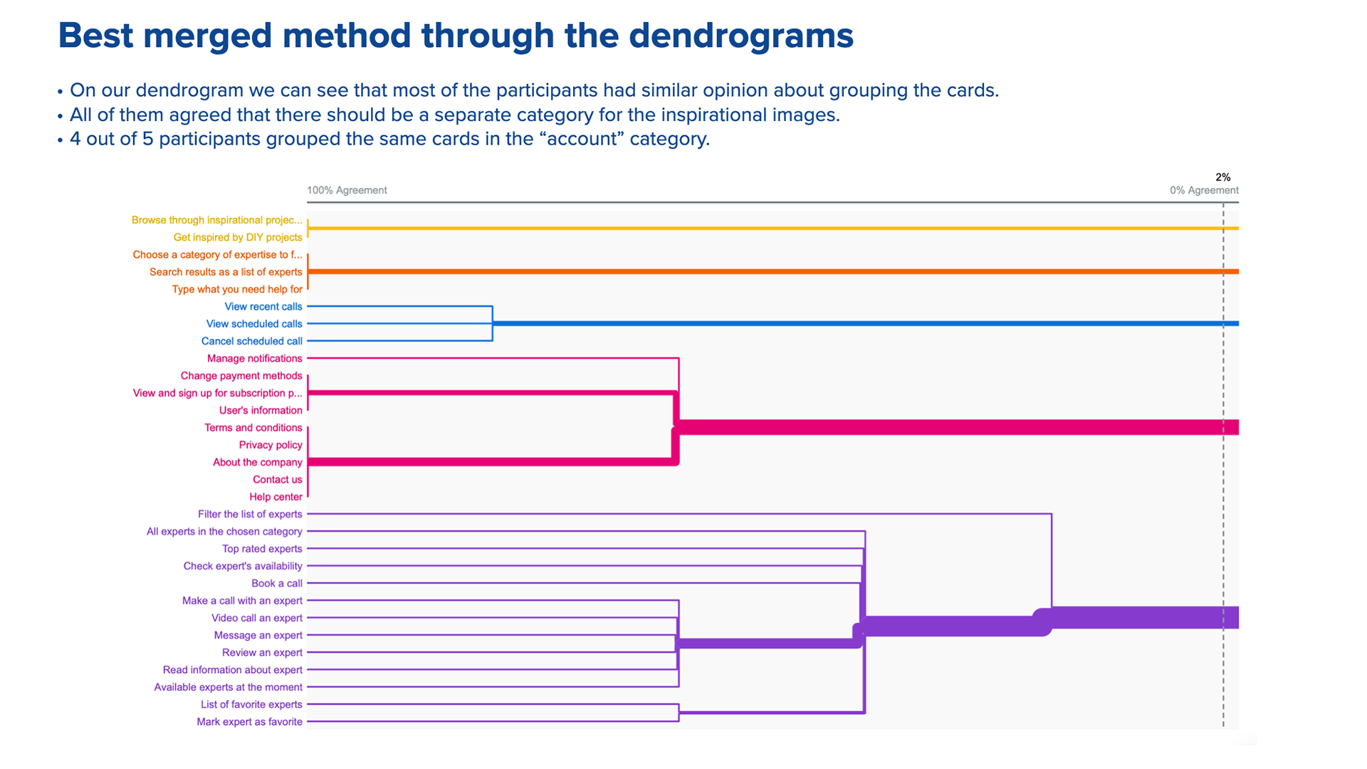
My first step into defining IA I conducted card sorting to generate ideas for the structure of the app.
I ended with 20 different cards and I used open card methodology and asked participants to organize the topics into categories that make the most sense to them. I found patterns that give clues about the most logical and user-friendly way to organize the app.
I ended with 20 different cards and I used open card methodology and asked participants to organize the topics into categories that make the most sense to them. I found patterns that give clues about the most logical and user-friendly way to organize the app.
See below some of the card sorting insight I got using the OptimalSort tool
Ideate
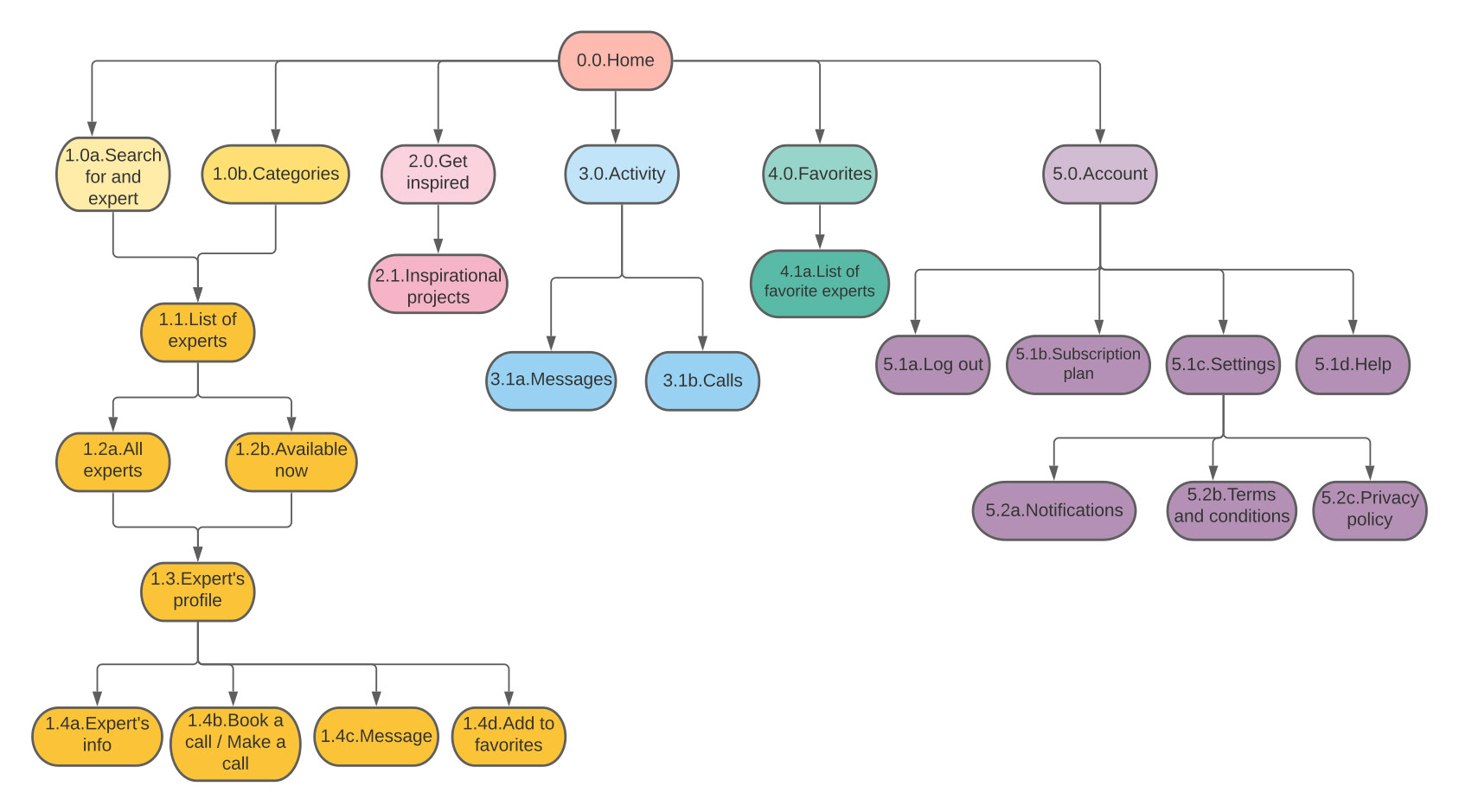
Site map
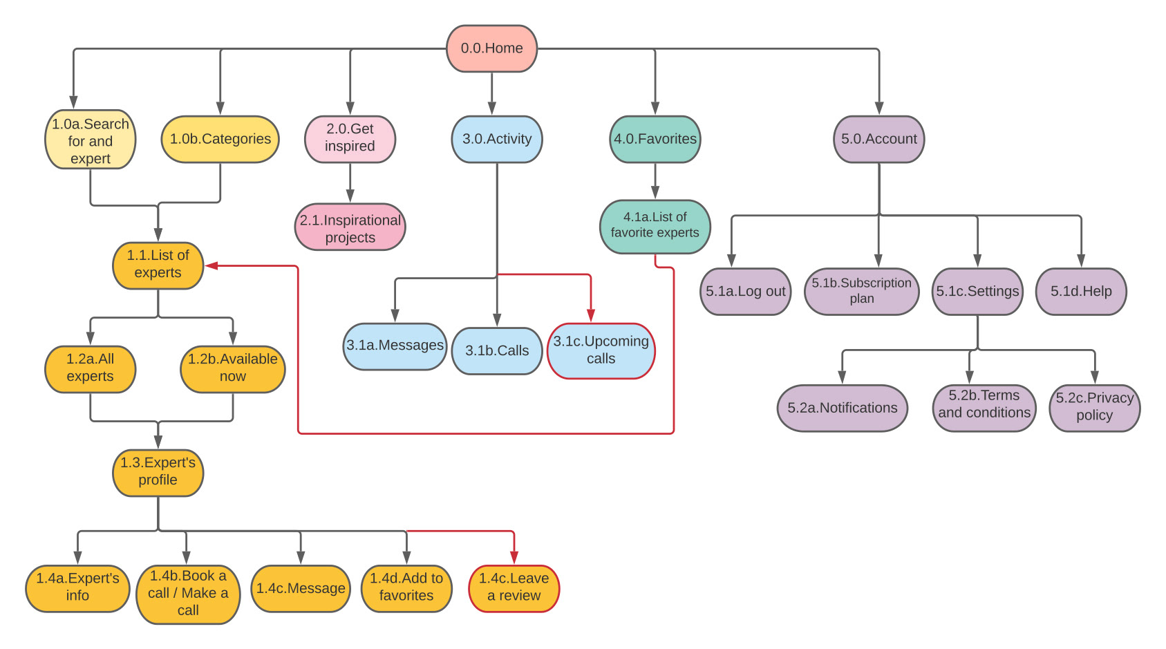
Overall, the results of my card sorting experiment fell in line with what I was expecting. Most of the participants shared similar opinion in grouping the cards. As a result, I revised my original site map.
- I connected “the list of the favorite Experts” with the “Expert’s profile” page, so users can navigate to that page if they want to connect with the Expert.
- I added another subcategory in the “Activity” tab, called “Upcoming calls”, so users can see their upcoming scheduled calls and manage them.
- I added an option to review an Expert, which can be done from the Expert’s profile page.
Original site map
Revised site map
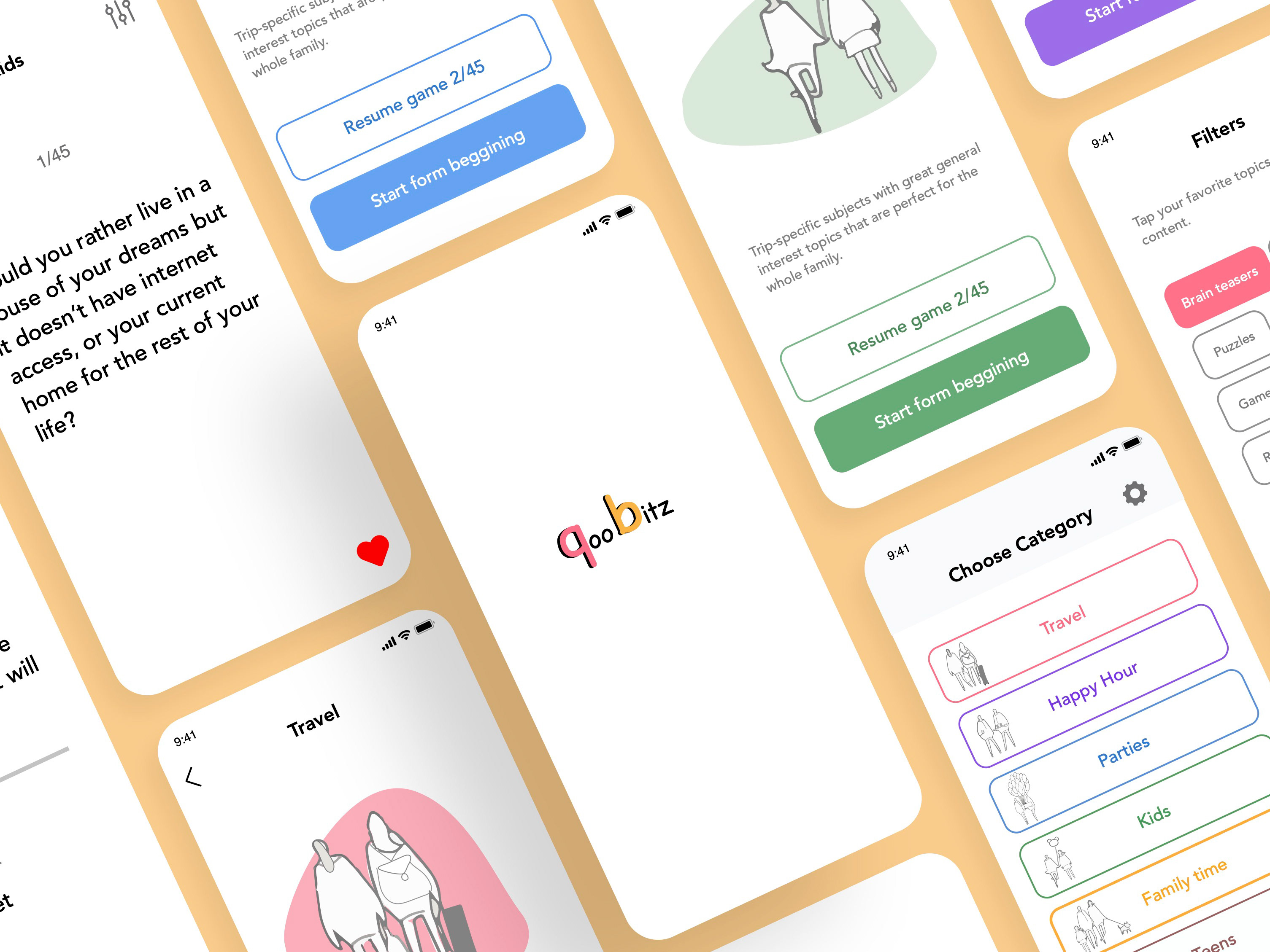
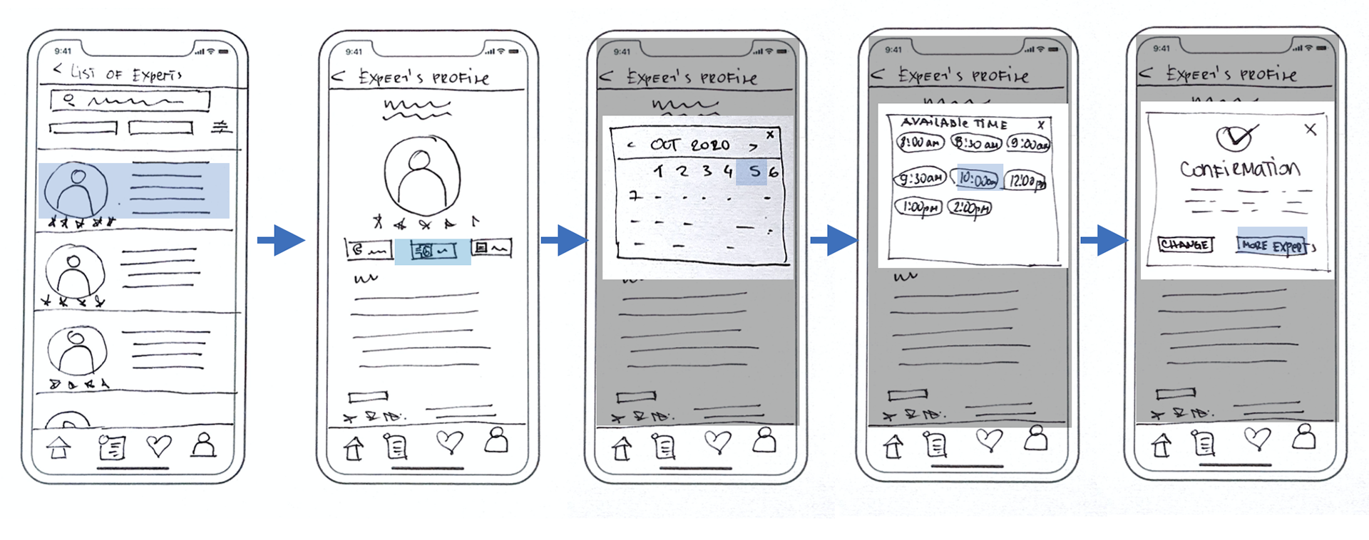
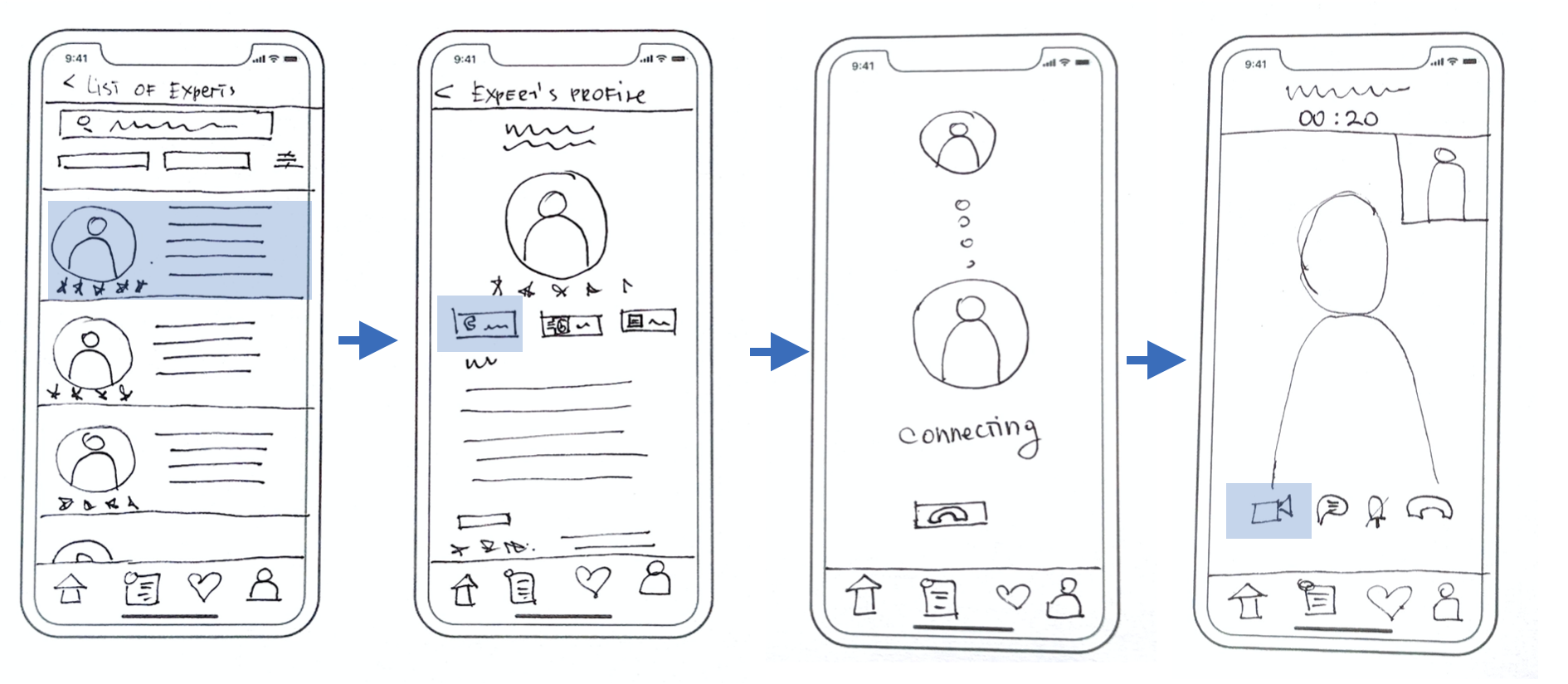
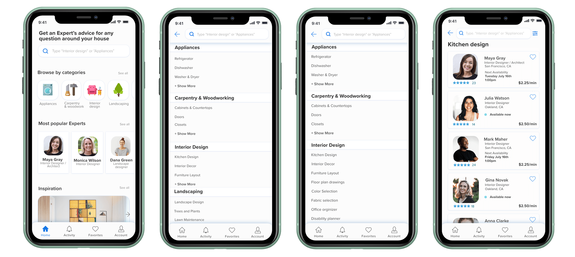
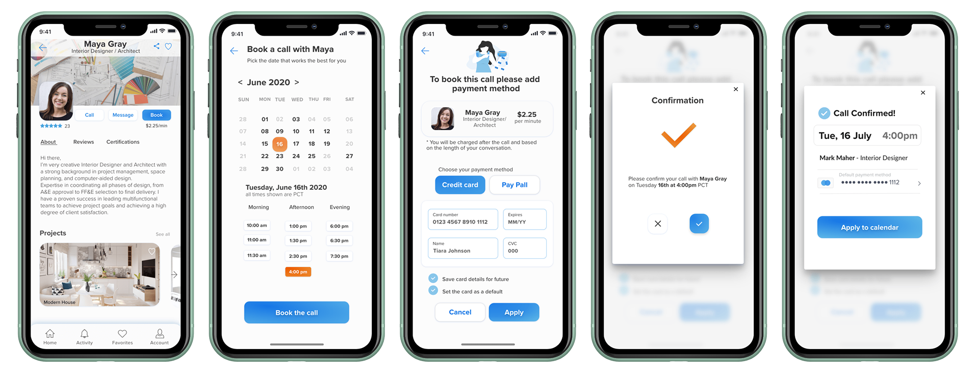
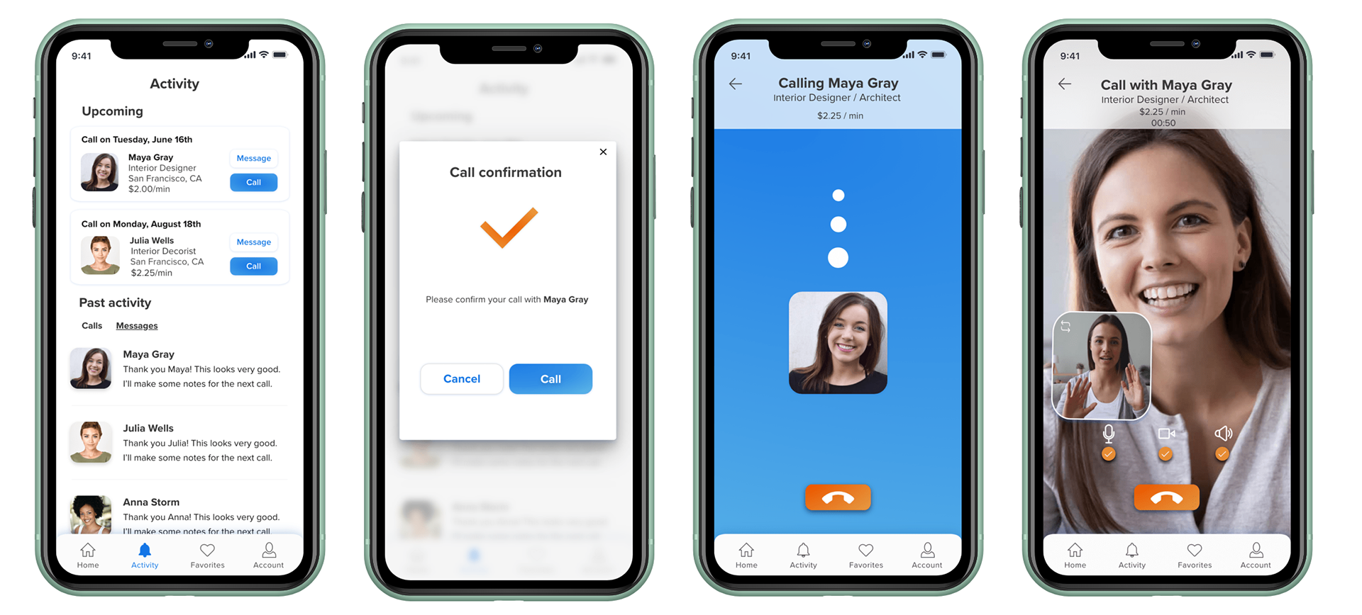
Prototyping
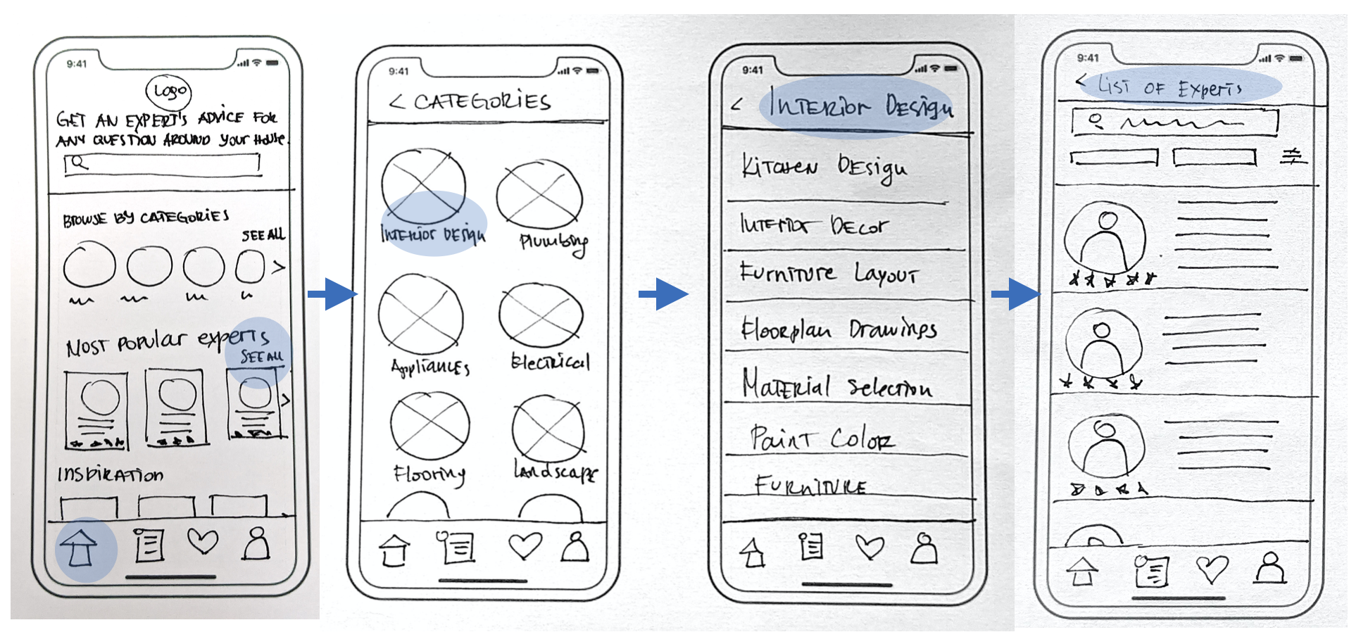
Low-fidelity prototypes
Here I began laying out the content by making low-fidelity paper prototypes. I started creating structure and hierarchy through the placement of page elements, features and other navigation components on three key pages: Home, Categories, and Expert Page.
What I realized was that building low-fidelity prototypes is a very important and time saving step of the design process. Stakeholders can agree on the base functionality of the app before devoting time and resources. Based on a received feedback, the prototype can be tweaked in a matter of seconds.
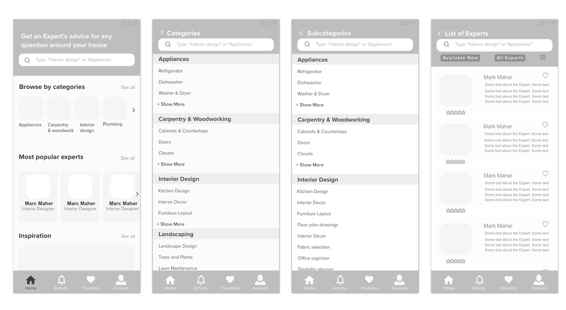
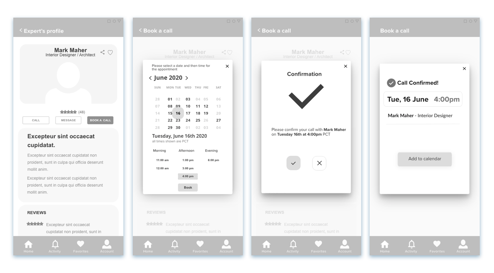
Prototyping
Mid-fidelity prototypes
Here I moved from low-fidelity wireframes and sketching into mid-fidelity and using Adobe XD. There were no major differences between the low and the mid-fidelity wireframes, except for the level of detail and the position of the elements on the screens.
This helped me to better understand the layout and how each element was positioned on the screen.
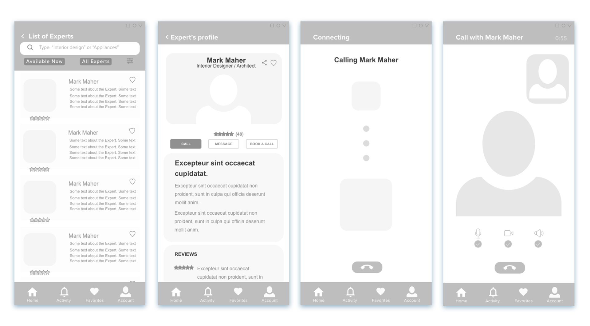
Test & prototyping
High-fidelity prototypes & testing
It was time to see how it all works...
With the mid-fidelity prototypes completed, this was the time to introduce them to the users for further insights and iterations.
Here is what I did to test my prototype:
Test plan
In order to conduct a successful test, I created a test plan that outlines the scope, goals, and logistic details . This approach helped me to stay focused on maintaining a clear vision of what I wanted to learn in the testing phase.
Test script
With the usability test script I outlined what I planned to say and communicate with my participants.
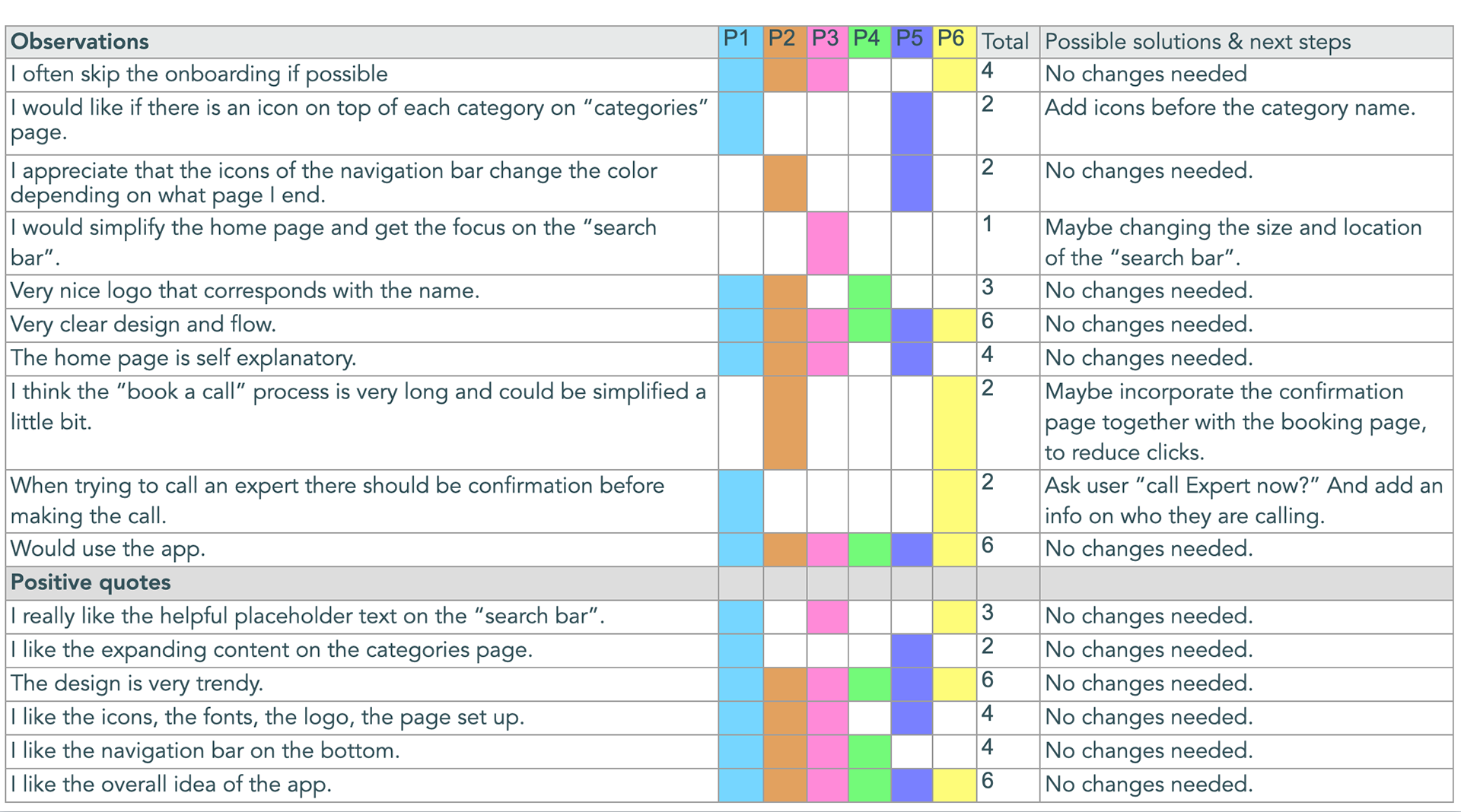
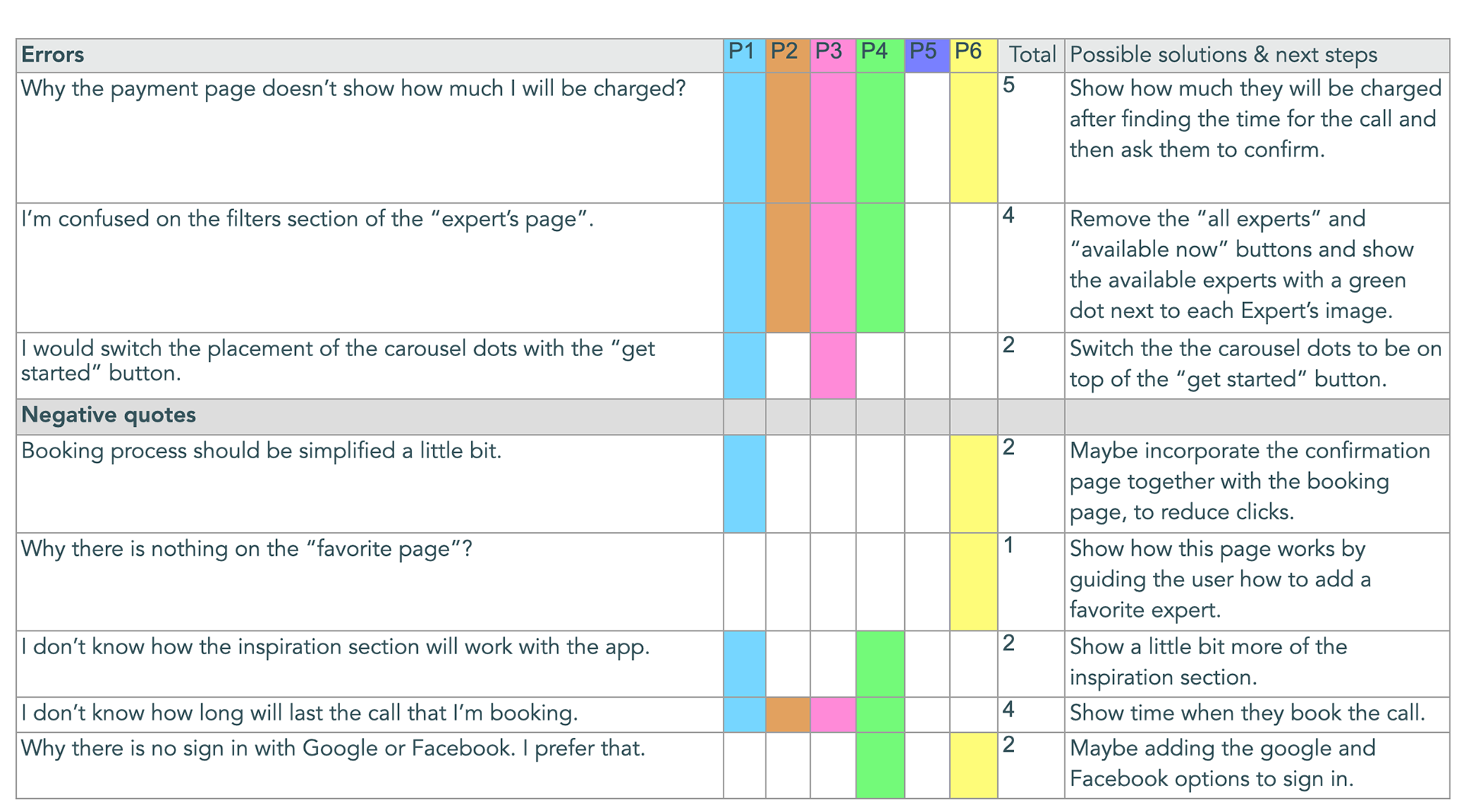
Test report
After testing 6 participants, I structured all the results into an affinity map and rainbow spreadsheet which helped me find the main pain points. I conducted both, in-person moderate and remote moderate tests.
While it can be tempting to help users to navigate through the prototype, I had to allow them to go through the process by themselves so that I can witness their feelings and behaviors.
Rainbow spreadsheets
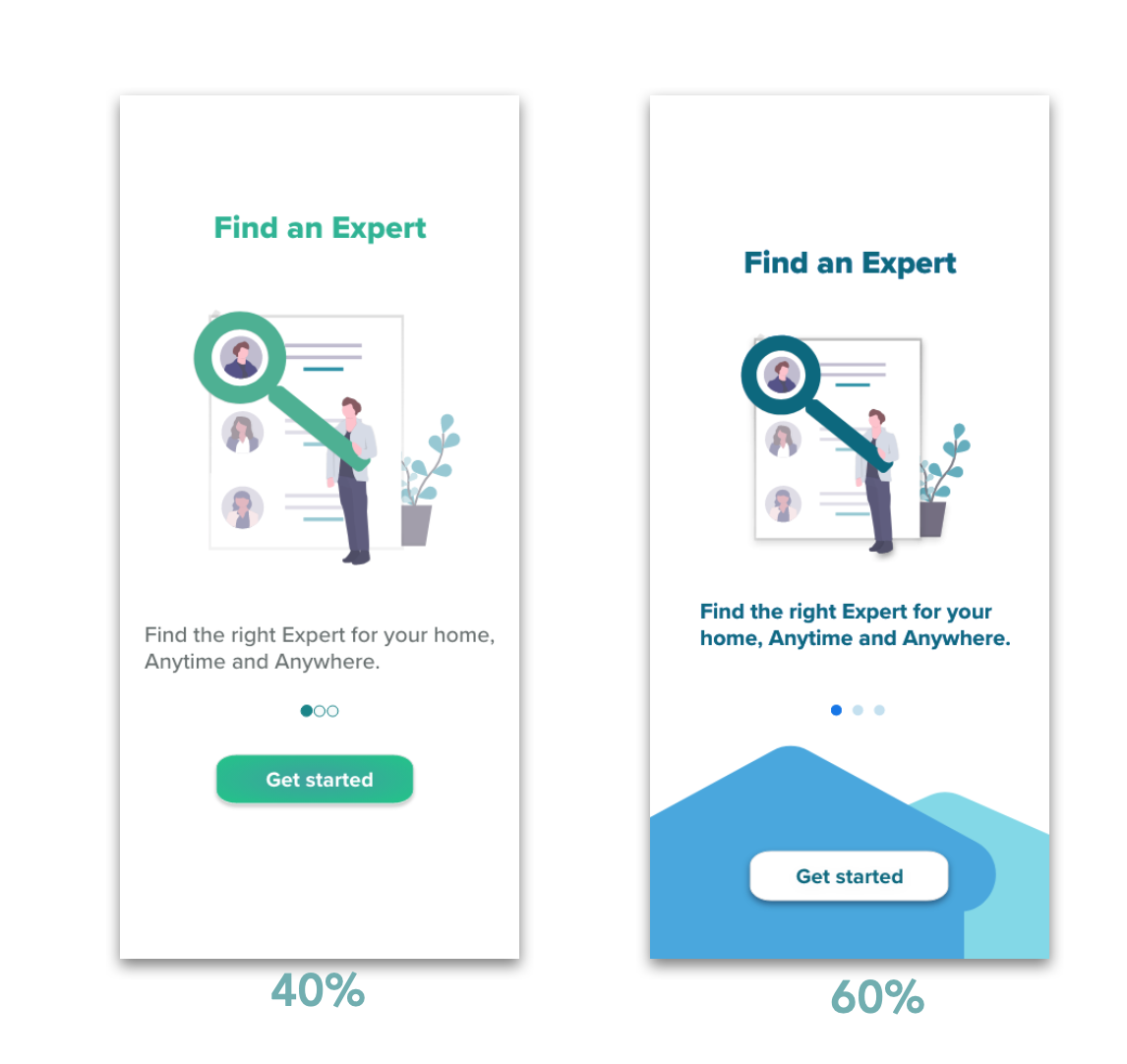
A/B testing
To further improve my already updated design and user flow, I conducted preference test with 10 participants by using the usabilityhub.com platform.
Conclusion: The result of the test confirmed that the new version looks more modern and the colors are more attractive. 60% of the users find the new version to be more unique and thoughtful.
Comments from participants:
" Simple and pleasant."
"Better colors."
"Looks more interesting and I like the idea of the story you are saying with the house looking shapes."
"Much more modern look."
Test & prototype
Design collaboration & polished prototype
Another day, another iteration...
After another iteration of the HomeExpert app, I decided to do another round of testing. I invited a few fellow designers for some peer reviewing of the design and I got valuable insight which lead me to another set with several updates.
Test & prototype
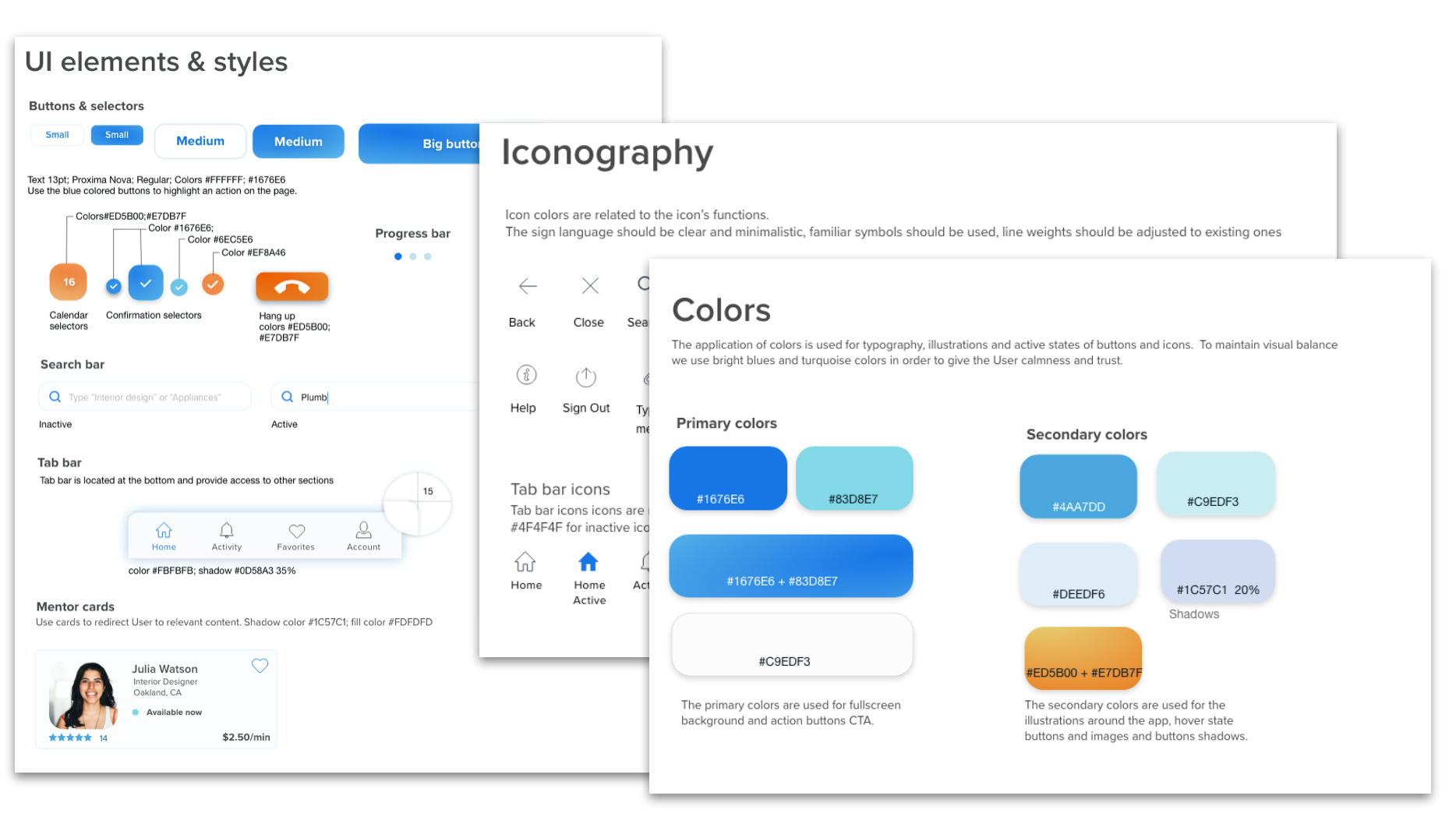
Design language system
After the testing phase I continued with polishing the design and I built a Design Language system.
Takeaways & future plans
We are not done yet, there is more!
In 3 months time, I created HomeExpert from the beginning to where it is today, and the journey was both challenging and rewarding.
The rewards
The biggest reward to me was the fact that I went through every stage of the design process. All of the big challenges required small steps of iteration and constant testing. While going through the whole iteration process, I learned a lot more about the users, the design, the tools, I learned to ask better questions, and to be more efficient during user interviews.
Future plans
Although, I'm very proud with the work I've created with HomeExpert, we know there is always room for improvement. The next thing that I plan on working is developing the Experts' side of the app, incorporating how the Experts can join the platform, create the experts profiles, and etc. I also want to perform further testing to improve the app's accessibility and ease of use.
Thank you for your time!